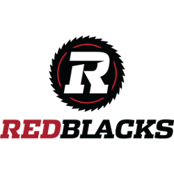
Ottawa Redblacks
A white letter “R” on a black razor saw with red highlights.
Ottawa Redblacks
2014 - Present
A white letter "R" on a black razor saw with red highlights. Wordmark "RED" in red and "BLACKS" in black.
Ottawa Redblacks
2014 - Present
A white letter "R" on a black razor saw with red highlights. Wordmark "ROUGE" in red and "ET NOIR" in black.
Ottawa Redblacks Alternate Logo
The Ottawa Redblacks alternate logo has emphasized bold typography and strong shield-inspired graphics. Early designs of the franchise established a modern identity that stood out within the league. As the Ottawa Redblacks logo history developed, alternate marks refined line work and balance while maintaining the team’s signature red, black, and white palette. Each version is preserved in accurate Ottawa Redblacks logo PNG format for reference.
Several alternate designs supported special events and merchandise campaigns. These variations complemented the primary emblem and strengthened brand consistency. Within the broader Ottawa Redblacks logo history, every Ottawa Redblacks alternate logo demonstrates a careful approach to visual identity. Updated Ottawa Redblacks logo PNG files allow fans and designers to review each stage of development.
Today, this complete archive presents every Ottawa Redblacks alternate logo introduced since the team’s founding. The structured Ottawa Redblacks logo history provides a clear timeline of branding updates. To learn more about the franchise’s background, visit the official Ottawa Redblacks History page. You can also explore our Ottawa Redblacks Wordmark Logo page to examine the team’s typographic evolution.