Anaheim Ducks
A webbed letter "D" duck's foot in gold with white highlights and black trim.
Buffalo Sabres
Wordmark "BUFFALO" in blue and tow lines above and below the wordmark. Vintage Sabres logo in bottom right.
Calgary Flames
A yellow with black outline horse's head and red flames coming out its nostrils.
Carolina Hurricanes
A hurricane warning flag, two red and black square flags and flying from a grey and black hockey stick. The shape of the state of North Carolina is formed in the space in between the two flags.
Chicago Blackhawks
A yellow letter "C" with red and green tomahawks crossed over it, worn on the Chicago Blackhawks red jersey starting in 1999 - 2000 season. The letter "C" stands for the city of Chicago.
Colorado Avalanche
A white with sliver trim triangle with the letter "C" in maroon with white trim on a dark blue mountain background.

Columbus Blue Jackets
A wordmark "COLUMBUS BLUE JACKETS" in a circle on a blue and red ribbon. A silver and blue cannon in the center. A blue and silver star at the bottom with a blue, red and silver outline.
Dallas Stars
The Stars logo centered in white and sliver on a green and black map of Texas. The letter "D" stands for the city of Dallas.
Detroit Red Wings
The red logo is of a automobile wheel with two wings coming from the center of the wheel. Logo mainly used on printed materials and products.

Edmonton Oilers
Oil worker handling a hockey stick. A wordmark "EDMONTON OILERS" in blue on a triangle background.
Los Angeles Kings
A throwback to the original 1967 crest, recolored in black, white, and silver.
Minnesota Wild
The head of a black bear created using Minnesota-area scenery, green pine trees, a wheat colored river, a red sky, yellow sun set and white shooting star inside a green and wheat circle featuring the team name. Wordmark "MINNESOTA WILD" in cream. Worn on the front of the Minnesota Wild alternate jersey which was ultimately promoted to home jersey.
Nashville Predators
A blue guitar pick with a yellow circle and three-stars in the middle to represent State of Tennessee. The letters "NP" at the bottom in blue with white outline. The letters "NP" stand for the city and the team nickname Nashville Predators.
New York Islanders
Initials "NY" in blue with the letter "Y" having a blue with four red stripes (4 Stanley Cups) hockey stick.
New York Rangers
Ranger shield in 3D with Statue of Liberty head and the letters "NYR" in red. The letters "NYR" stand for New York Rangers.
Ottawa Senators
The letter "S" in white trimmed in red inside a black and gold circle. Inside the gold are black laurel leaves with EST. MDCCCXCIV. This is the Roman Numeral for 1894, the first season that the team which became the original Ottawa Senators team started play.

Philadelphia Flyers
A 3-D version of the Flyers primary logo. A black P-Wing with an orange circle in the middle. The letter "P" stands for the city of Philadelphia.

Pittsburgh Penguins
A wordmark "PITTSBURGH" in black above "PENGUINS" in black with gold highlight. All above the primary logo of a black penguin skating with a hockey stick in front of a gold triangle.

San Jose Sharks
Black shark fin inside an orange diamond with teal and white waves. All shades of teal were lightened for the 2008 - 2009 season.

St. Louis Blues
An upward-pointing trumpet in gold and blue with the St. Louis Gateway Arch in gold and the rippling waters of the Mississippi River in blue integrated into the right side of the design.
Tampa Bay Lightning
A blue circle with white lightning bolt inside the circle with wordmark "TAMPA BAY LIGHTNING HOCKEY CLUB" in white. Two small lightning bolts at the bottom.

Toronto Maple Leafs
Inspired by the classic Leafs logo of the 1940’s to 1960’s, the club’s new mark has a number of design characteristics that distinguish it.

Utah Mammoth
A letter "U" for the state of Utah in black block lettering in blue trim with a mammoth tusk in white and blue highlight shown over the letter.

Vancouver Canucks
A white rectangle with blue trim with a blue hockey stick inside, outlined in green.
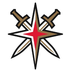
Vegas Golden Knights
The Golden Knights alternate logo include swords that create the star from the iconic "Welcome to Las Vegas" sign.
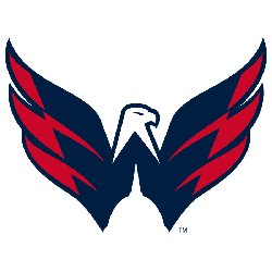
Washington Capitals
A blue and red eagle with the top of the U.S. Capitol as a silhouette below.
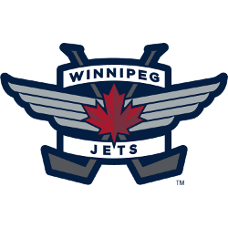
Winnipeg Jets
Red maple leaf on an air force badge with crossed hockey sticks. Wordmark "WINNIPEG JETS" in blue on white background.


