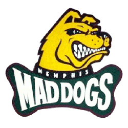
Memphis Mad Dogs Alternate Logo
The Memphis Mad Dogs alternate logo designs were created to strengthen the team’s presence in the CFL expansion era. These alternate marks featured aggressive dog imagery, sharp detailing, and strong color combinations. They supported the primary branding while offering fans additional visual options tied to Memphis Mad Dogs CFL identity. For a complete overview of the franchise timeline, visit the Memphis Mad Dogs History page.
Alternate logos helped the franchise maintain visual consistency across merchandise and promotional campaigns. While the primary emblem carried the main brand message, alternates allowed flexibility in design applications. To compare these designs with the team’s official lettering style, explore the Memphis Mad Dogs Wordmark Logo page for more details.
Although the franchise had a brief run, the Memphis Mad Dogs logo history remains an important part of CFL branding history. Every Memphis Mad Dogs alternate logo highlights the team’s effort to build recognition in a competitive sports market. Today, these logos stand as historical symbols of the Memphis Mad Dogs CFL era and its unique expansion chapter.
Mad Dogs Products
Auto Amazon Links: Could not resolve the given unit type, . Please be sure to update the auto-insert definition if you have deleted the unit.
