Edmonton Elks
A letter “E” twice in green with gold trim connected together representing the team initials.

Edmonton Elks
2025 - Present
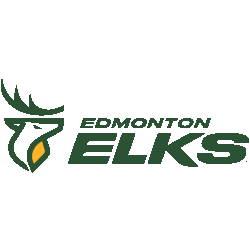
A double-lined wordmark "EDMONTON ELKS" in green with four lines in both green and gold.
Font: Custom
Edmonton Elks
2021 - 2024
The original Elks logo is a green and white elk's head on a gold and green shield, with a single flat antler above. Below the logo is a wordmark in small font, "EDMONTON" and "ELKS" in larger font, all in green.
Font: Sans-serif
https://freefontsfamily.net/sans-serif-font-family-free-download/
Edmonton Elks
2021 - 2024
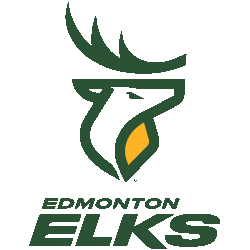
The original Elks logo is a green and white elk's head on a gold and green shield, a single flat antler above in green. Below the logo is a wordmark "EDMONTON" in a small font and "ELKS" in a larger font all in green.
Font: Sans-serif
https://freefontsfamily.net/sans-serif-font-family-free-download/

Edmonton Elks
2021 - 2024
Wordmark "EDMONTON ELKS" in green.
Font: Sans-serif
https://freefontsfamily.net/sans-serif-font-family-free-download/

Edmonton Elks
2021 - 2024
Wordmark "EDMONTON ELKS" in green stacked with Edmonton above in a smaller typeface. The E's are designed to resemble the EE logo used by the previous Edmonton Eskimos.
Font: Sans-serif
https://freefontsfamily.net/sans-serif-font-family-free-download/
Edmonton Elks Wordmark Logo
The Edmonton Elks wordmark logo has shifted from traditional block lettering to cleaner and more contemporary typography. Early versions emphasized bold, straightforward fonts that reinforced brand recognition. As the Edmonton Elks logo history developed, designers refined spacing and alignment to improve clarity. Each stage is documented in accurate Edmonton Elks logo PNG format.
Modern updates within the Edmonton Elks logo history focused on creating stronger visual harmony between typography and emblem elements. The refined Edmonton Elks wordmark logo now delivers improved readability across digital platforms and merchandise. Archived Edmonton Elks logo PNG files allow precise comparison between historical and current wordmark designs.
Today, this collection features every Edmonton Elks wordmark logo introduced throughout the Edmonton Elks logo history. The structured archive provides a clear timeline of typographic evolution. To learn more about the franchise’s background, visit the official Edmonton Elks History page. You can also explore our Edmonton Elks Primary Logo page to compare symbol-based branding elements.


