Calgary Stampeders
A white horse galloping with a black drop shadow. Revised primary logo from the ’90s.
Calgary Stampeders
2020 - Present
A galloping white horse with a black drop shadow on a red circle with black and white trim.
Moved to alternate logo in 2020.

Calgary Stampeders
2013 - 2019
A white with black drop shadow horse galloping.

Calgary Stampeders
2011 - 2015
A galloping white horse with a black drop shadow on a red circle with black and white trim.

Calgary Stampeders
2011 - 2012
A galloping white with black drop shadow horse on a red circle with a gradient and a black and white trim.

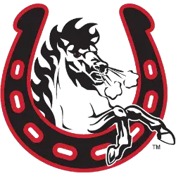
Calgary Stampeders
2003 - Present
A white and black horse through a black and red horseshoe.
Calgary Stampeders Alternate Logo
The Calgary Stampeders alternate logo has reflected different design trends across decades. Early versions of the Calgary Stampede football logo featured traditional western influences, bold typography, and classic football imagery. As the Calgary Stampeders logo history progressed, alternate marks introduced cleaner lines and modern styling while preserving the iconic running horse identity.
Several alternate designs were created for special events, anniversary celebrations, and promotional use. These variations complemented the primary mark and strengthened brand consistency. The broader Calgary Stampeders logo history demonstrates how each Calgary Stampeders alternate logo maintained heritage elements while adapting to contemporary branding standards.
Today, this complete archive presents every documented Calgary Stampeders alternate logo from start to present day. The detailed Calgary Stampeders logo history allows fans and designers to trace visual changes tied to the Calgary Stampede football logo tradition. To explore more about the franchise’s background, visit the official Calgary Stampeders History page. You can also review our Calgary Stampeders Wordmark Logo page to examine the team’s typographic evolution.
College Sports Fan Products