Tampa Bay Vipers
2020 - 2023
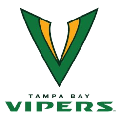
A green with dark green trim letter "V" and a yellow with dark green viper fangs. Wordmark "TAMPA BAY" in dark green and "VIPERS" in green.

Tampa Bay Vipers
2020 - 2023
A green with dark green trim letter "V" and a yellow with dark green viper fangs. Wordmark "TAMPA BAY" in dark green and "VIPERS" in green.
Tampa Bay Vipers Primary Logo
The Tampa Bay Vipers logo history began in 2019 when the Tampa Bay Vipers XFL team was introduced for the league’s 2020 relaunch. The Tampa Bay Vipers primary logo featured a striking green viper head with sharp fangs and intense yellow eyes. Its bold curves and angled lines emphasized speed and precision, while the green and yellow palette created instant visual recognition.
As part of the broader Tampa Bay Vipers logo history, the primary emblem remained consistent throughout the team’s active XFL season. Designers focused on clarity and digital adaptability, ensuring the Tampa Bay Vipers primary logo performed well across uniforms, broadcast graphics, and merchandise. The sharp serpent profile reinforced the aggressive branding strategy of the Tampa Bay Vipers XFL identity.
Although the franchise later relocated, the Tampa Bay Vipers logo history remains an important chapter in modern spring football branding. The Tampa Bay Vipers primary logo continues to be referenced by fans and collectors who followed the Tampa Bay Vipers XFL era. For a complete franchise timeline, visit the Tampa Bay Vipers History page. You can also compare design variations on our Tampa Bay Vipers Alternate Logo page.


