Since immemorial, soccer teams have rebranded their logos to improve their image. And for any soccer fan, this does not pass their sight silently. There are so many ways in which fans stay committed to their teams, and getting concerned about the outlook of logos is just one of the many ways. For those who bet as a sign of …
MLS Team Logo Battle
MLS Primary LogoMLS Alternate LogoMLS Wordmark LogoMLS Team HistoryMLS Greatest Player (Unlimited votes) Choose your favorite current MLS team logo? Atlanta United FC Primary Logo 2017 – Present Austin FC Primary Logo 2021 – Present CF Montreal Primary Logo 2023 – Present Charlotte FC Primary Logo 2022 – Present Chicago Fire FC Primary Logo 2021 – Present Colorado Rapids Primary …
Sporting Kansas City Wordmark Logo
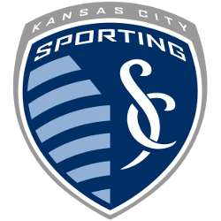
Sporting Kansas City 2011 – Present A grey shield with a wordmark “KANSAS CITY” in white at the top of the shield. Below the wordmark is a blue with a white trim mini shield with a wordmark “SPORTING” in white above light blue stripes next to custom font interlocked initials “SC” in white. Sporting Alternate LogoSporting Primary LogoSporting Team HistorySporting …
Sporting Kansas City Alternate Logo
Sporting Kansas City 2011 – Present A grey shield with a wordmark “KANSAS CITY” in white at the top of the shield. Below the wordmark is a blue with a white trim mini shield with a wordmark “SPORTING” in white above light blue stripes next to custom font interlocked initials “SC” in white. Sporting Primary LogoSporting Wordmark LogoSporting Team HistorySporting …
Sporting Kansas City Primary Logo
Sporting Kansas City 2011 – Present A grey shield with a wordmark “KANSAS CITY” in white at the top of the shield. Below the wordmark is a blue with a white trim mini shield with a wordmark “SPORTING” in white above light blue stripes next to custom font interlocked initials “SC” in white. Sporting Alternate LogoSporting Wordmark LogoSporting Team HistorySporting …
MLS Wordmark Logo
Wordmark Logos Austin FC Wordmark “AUSTIN FC” in black.See Team LogosChicago Fire FC A mirror image of a crown in orange and a flame in red. Wordmark “CHICAGO FIRE” in blue and below “FOOTBALL CLUB” in blue.See Team LogosColorado Rapids A double lined arched wordmark “COLORADO” in burgundy and “RAPIDS” in burgundy.See Team LogosColumbus Crew Double-lined wordmark “THE” on top …
MLS Alternate Logo
Alternate Logos Chicago Fire FC A mirror image of a crown in orange on top and a flame in red below.See Team LogosColorado Rapids Slight colors adjusted from the previous logo. A roundel logo with a soccer ball in the center on a green stared background with a circular wordmark “COLORADO RAPIDS” in gold with white trim on a blue …
MLS Primary Logo
Primary Logos Atlanta United FC A black roundel logo with a bold letter “A” in gold on a black and red background. Wordmark “ATLANTA UNITED FC” encircled in gold. See Team Logos Austin FC Twin green oak trees inside a black with green trim shield and wordmark “AUSTIN” above in white. See Team Logos CF Montréal The shield, which has …
MLS Logo History
MLS Logos PRIMARY See each and every team’s primary logos from the MLS.See TeamsALTERNATE See each and every team’s alternate logos from the MLS.See TeamsWORDMARK See each and every team’s wordmark logos from the MLS.See TeamsSoccer Sports Fan Products Topps 2023 Series 1 Baseball MLB Set of 3 Packs – 16 Cards per Pack – 48 Trading Cards Total 4.6 …


