This fantastic collection showcases ten of the most extraordinary sports logo redesigns. These logos revamps brought a vibrant, compelling visual identity to numerous sports teams, effectively reflecting the spirit of each franchise and achieving great success with both team members and their supporters. Ranging from gentle tweaks to more daring and current facelifts, these transformations have proven the remarkable ability …
MLS Teams Logo Battle – Vote for the Best MLS Logos
Welcome to the MLS Teams Logo Battle, where soccer fans can explore all MLS team logos and vote for their favorites. Compare designs, support your club, and watch how MLS logos ranked as fans decide which emblems stand out across Major League Soccer.MLS Primary LogoMLS Alternate LogoMLS Wordmark LogoMLS Team HistoryMLS Greatest Player (Unlimited votes) Choose your favorite current MLS …
Seattle Sounders FC Logo History – Wordmark Logo
The Seattle Sounders FC wordmark logo captures the deep maritime roots and the “Eternal Blue, Forever Green” spirit of the Northwest. Since 1974, the Seattle Sounders FC logo history has moved from classic wave designs to a sleek, modern crest. Find every Seattle Sounders FC logo PNG in our archive. Seattle Sounders FC 2024 – Present The Space Needle is …

Seattle Sounders FC Logo History – Alternate Logo
The Seattle Sounders FC alternate logo represents the soaring ambition of a Pacific Northwest soccer powerhouse. Since 1974, the Seattle Sounders FC logo history has evolved from classic NASL designs to modern, sleek emblems. Whether you need a Seattle Sounders FC logo PNG or a timeline of badge changes, we offer the complete collection. Seattle Sounders FC 2024 – Present …
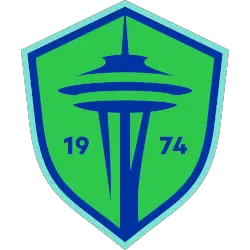
Seattle Sounders FC Logo History – Primary Logo
The Seattle Sounders FC primary logo is an iconic symbol of American soccer excellence and Pacific Northwest pride. Since 1974, this emblem has evolved through several eras to reflect the club’s growing legacy. Whether you need a high-quality Seattle Sounders FC logo PNG or want to study the Seattle Sounders FC logo history, we have everything you need. Seattle Sounders …
MLS Logo History – All Major League Soccer Wordmark Logos
The MLS logo history showcases how professional soccer established its visual voice in North America. This archive documents every official MLS wordmark logo and evolution of the major league soccer logo. Consequently, fans can track the league’s journey from a bold startup to a premier global sports organization through these designs.MLS Primary LogoMLS Alternate LogoMLS Logo BattleMLS Team HistoryAtlanta United …
MLS Logo History – All MLS Teams Alternate Logos
The MLS logo stands as the central symbol of professional soccer’s growth in the United States and Canada. Over the decades, the MLS logo history has shifted from 1990s flair to a sophisticated, modern identity. Consequently, every MLS alternate logo helps define the unique personality of the many major league soccer teams within the league today.MLS Primary LogoMLS Wordmark LogoMLS …
MLS Primary Logo History – ALL MLS Teams Primary Logos
The MLS logo history highlights the steady growth of professional soccer in North America. From the original design to the modern shield, the MLS primary logo reflects the ambition and expansion of the league. Over time, the major league soccer logo has evolved alongside all major league soccer teams, creating a unified yet flexible identity that represents the league from …
MLS Logo History – All Major League Soccer Teams Logos
The MLS logo stands as a powerful symbol of professional soccer in North America. From its early identity to the modern shield, the MLS logo history reflects the growth of the league and the evolution of the major league soccer logo across decades. Today, all major league soccer teams carry unique crests that connect local culture with league-wide branding, and …