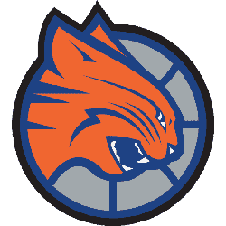
Charlotte Bobcats 2013 – 2014 In 2013 a new color scheme added to the existing logo. The Bobcat is now in gray and not orange. The wordmark “BOBCATS” is now in white and the wordmark “CHARLOTTE” now in orange and inside the logo and not on top of the logo.Bobcats Primary LogoBobcats Wordmark LogoBobcats Team HistoryBobcats Alternate Logo The Charlotte …
Charlotte Hornets Alternate Logo
Charlotte Hornets 2015 – Present The new Hornets logo utilizes the purple and teal color palette and features an aggressive looking hornet that is ready to attack. Its piercing eyes, raised antennae, expanded wings and pointed stinger depict its relentless intensity. Incorporated within the logo is a basketball that doubles as the hornet’s body. The logo contains several odes to …
New Jersey Nets Alternate Logo
New Jersey Nets 1998 – 2012 The Nets brought back the shield concept from their first logo while keeping the basketball that has been part of all but one. Most significantly, the team changed its color scheme for the first time: deepening the red and swapping royal blue for navy, also adding silver and dark grey.Nets Primary LogoNets Wordmark LogoNets …
Brooklyn Nets Alternate Logo
Brooklyn Nets 2025 – Present A black letter “B” on a white basketball with black seams inside a black circle with the wordmark “BROOKLYN NETS” arched around in white. Nets Primary LogoNets Wordmark LogoNets Team HistoryNets Team MerchNets Alternate Logo The Brooklyn Nets have had a long and storied history in the National Basketball Association, particularly in relation to the …
Boston Celtics Alternate Logo
Boston Celtics 1997 – Present The world-famous figure has his left eye winking at you, his left hand resting on his shillelagh, his right index finger is pointing straight upward with a brown basketball sitting atop, his left foot crossed over and to the side of the right foot, he possesses a big smile (with a pipe projecting from the …
Atlanta Hawks Alternate Logo
Atlanta Hawks 2021 – Present A minor update to the Atlanta Hawks primary logo for the 2020 – 2021 NBA season, the Hawks updated the font used in the wordmark in the roundel and also removed the word “CLUB” from the logo entirely. The team’s modernized “Pac-Man” logo remains, surrounded now with “ATLANTA HAWKS BASKETBALL” in white. Hawks Primary LogoHawks …
Atlanta Hawks Wordmark Logo
Atlanta Hawks 2021 – Present A minor update to the Atlanta Hawks primary logo for the 2020 – 2021 NBA season, the Hawks updated the font used in the wordmark in the roundel and also removed the word “CLUB” from the logo entirely. The team’s modernized “Pac-Man” logo remains, surrounded now with “ATLANTA HAWKS BASKETBALL” in white. Hawks Alternate LogoHawks …
Chicago Packers Primary Logo
Chicago Packers 1961 – 1962 The Packers original logo in 1962, a black outline of a bull’s head on a brown basketball.Packers Team HistoryPackers Primary Logo The Chicago Packers’ primary logo is a symbol of success and perseverance. It has come to represent the team’s commitment to excellence on and off the court. The iconic green-and-yellow design was first introduced …
Chicago Zephyrs Primary Logo
Chicago Zephyrs 1962 – 1963 The new team called Zephyrs would feature a wordmark “Zephyrs” in gold with a white and black outline diagonally. The letters are streaking to symbolize wind.Zephyrs Team HistoryZephyrs Primary Logo The Chicago Zephyrs are a professional basketball team based in Windy City. They have been around since 1967 and their primary logo has gone through …
Baltimore Bullets Primary Logo
Baltimore Bullets 1971 – 1972 Wordmark“bullets” in light blue with the letters “l” forming two hands grabbing for a orange basketball. A wordmark ‘BALTIMORE” in light blue on the top and to the right of the main wordmark.Bullets Team HistoryBullets Primary Logo The Baltimore Bullets’ primary logo has a long and exciting history. The original logo, used from 1963 to …