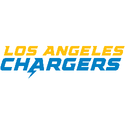
The Los Angeles Chargers logo wordmark shows off a fast, modern look that mirrors the team’s electric identity. It uses sharp lettering and tight alignment to express speed and focus. While the wordmark has changed slightly over time, it still fits well with the overall brand. This makes it a strong part of the team’s style and los angeles chargers …
Los Angeles Chargers Logo History – Alternate Logo
The Los Angeles Chargers logo is widely recognized for its clean lightning bolt design. While the main look has stayed consistent, several alternate versions have been used. These include simplified bolts, dark-outlined styles, and the new Los Angeles Chargers logo from recent rebranding. These variations offer fans a visual timeline of the franchise’s style and growth. Los Angeles Chargers 2020 …
Los Angeles Chargers Logo History & Primary Design
The Los Angeles Chargers logo is a clean and dynamic emblem that reflects energy, speed, and the team’s electric identity. With its bold lightning bolt design, the logo has become a core part of the Chargers’ visual brand. Whether you’re following the Los Angeles Chargers logo history or spotting the bolt on merchandise, the Los Angeles Chargers logo stands out …


