The Los Angeles Chargers have experienced a range of situations over the past thirty-eight years, including ups, downs, twists, and turns. The team has caught the public’s attention over the years, and much has been discussed about them. One of these is the team’s identity. Do the Los Angeles Chargers have an identity? The team has a logo that is …
Chargers Do a Better Job With Second Los Angeles Logo Unveiling
As the team gets ready to begin play at the new SoFi Stadium this fall, the Los Angeles Chargers did a better job of revealing a new logo than they did three years ago. If you recall, the team marked its move to Los Angeles with a logo that had the same colors and looked like the baseball Dodgers’ logo …
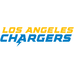
Los Angeles Chargers Logo History – Wordmark Logo
The Los Angeles Chargers logo wordmark shows off a fast, modern look that mirrors the team’s electric identity. It uses sharp lettering and tight alignment to express speed and focus. While the wordmark has changed slightly over time, it still fits well with the overall brand. This makes it a strong part of the team’s style and los angeles chargers …
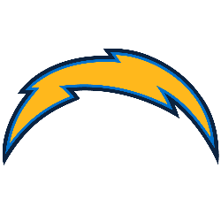
Los Angeles Chargers Logo History & Primary Design
The Los Angeles Chargers logo is a clean and dynamic emblem that reflects energy, speed, and the team’s electric identity. With its bold lightning bolt design, the logo has become a core part of the Chargers’ visual brand. Whether you’re following the Los Angeles Chargers logo history or spotting the bolt on merchandise, the Los Angeles Chargers logo stands out …