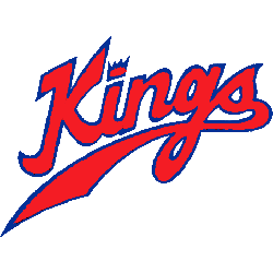
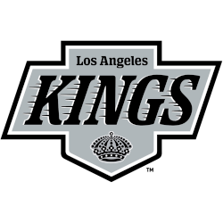
Los Angeles Kings Wordmark Logo
The Kings sport three current wordmark logos with the classic streaking “KINGS” now in black. (adsbygoogle = window.adsbygoogle || []).push({}); Kings Alternate Logo Kings Primary Logo Kings Concept Logo Kings Team History amzn_assoc_placement = “adunit0”; amzn_assoc_tracking_id = “yorkshirete03-20”; amzn_assoc_ad_mode = “search”; amzn_assoc_ad_type = “smart”; amzn_assoc_marketplace = “amazon”; amzn_assoc_region = “US”; amzn_assoc_default_search_phrase = “Los Angeles Kings Hockey NHL”; amzn_assoc_default_category = “All”; …
Los Angeles Kings Alternate Logo
Kings have three current and active alternate logos. They are two crowns with a different look to each, along with a regal shield of royalty in their alternate logos. (adsbygoogle = window.adsbygoogle || []).push({}); Kings Primary Logo Kings Wordmark Logo Kings Concept Logo Kings Team History amzn_assoc_placement = “adunit0”; amzn_assoc_tracking_id = “yorkshirete03-20”; amzn_assoc_ad_mode = “search”; amzn_assoc_ad_type = “smart”; amzn_assoc_marketplace = …
Los Angeles Kings Primary Logo
Los Angeles is the only city in the world that is known as much for its initials as it is its actual name, so why not add it to a logo. On Nov. 22, 2008, the Los Angeles Kings went “Back in Black” at STAPLES Center, in front of a sellout crowd of 18,118 fans unveiling their new logo and …
Kansas City Kings Primary Logo
While in Kansas City for over 10 years the Kings logo stay the same. They did change some colors and the location city either Kansas City or Kansas City-Omaha. (adsbygoogle = window.adsbygoogle || []).push({}); Kings Wordmark Logo Kings Team History amzn_assoc_placement = “adunit0”; amzn_assoc_tracking_id = “yorkshirete03-20”; amzn_assoc_ad_mode = “search”; amzn_assoc_ad_type = “smart”; amzn_assoc_marketplace = “amazon”; amzn_assoc_region = “US”; amzn_assoc_default_search_phrase = …
Sacramento Kings Primary Logo
The new primary emblem is inspired by the Kings classic logo from 1985. It is reimagined to reflect the civic and franchise pride that has lasted and grown for a generation. Now, with a clean, modern look – a reshaped crown, refined basketball and new typeface that puts Sacramento front and center – the new identity draws from the team’s …