
Grand Canyon Antelopes
Wordmark "LOPES" in purple using a custom font called Thunder.
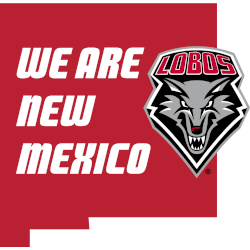
New Mexico Lobos
A slogan wordmark, "WE ARE NEW MEXICO," features the primary logo in red on the state shape of New Mexico.
A new shade of silver.
San Jose State Spartans
Wordmark "SAN JOSE STATE" and "SPARTANS" with a custom font in blue.

Mountain West Conference Logo History
Early Mountain West Conference wordmark logo designs focused on clarity and balance. Because league branding required consistency, designers used clean lettering and strong alignment. These wordmarks appeared on schedules, media graphics, and official materials. As a result, the Mountain West Conference logo history established a recognizable text identity that supported all Mountain West Conference teams equally.
Over time, the Mountain West Conference wordmark logo adopted refined spacing and modern fonts. Therefore, newer designs improved readability across print and digital platforms. Still, designers preserved core letter structure. Because of this, the Mountain West Conference logo history remained unified, while Mountain West Conference teams continued using familiar league branding across seasons.
Today, the Mountain West Conference wordmark logo appears across digital media, broadcasts, and championship branding. Meanwhile, the design supports flexibility without losing identity. As a result, the Mountain West Conference logo history stays clear and professional. For official league background, visit Mountain West Conference Wikipedia. You can also visit the Mountain West Conference primary logo page to compare symbol-based designs.