Saskatchewan Roughriders
A letter “S” on a green field between two stalks of wheat in white on a black border. Updated version of their previous logo (1985-2015) with silver removed among other small changes.
Roughriders Alternate Logo
The first ever logo used by the Roughriders was created in 1910 when they were known as the Regina Rugby Club – it featured an image of two crossed rugby sticks with three stars above them, which represented Regina's three major sports teams: football, hockey, and baseball. This logo remained unchanged until 1948 when it was replaced with one featuring a green horse head surrounded by laurel leaves – this design is still used today as part of their current primary logo but without any text or other elements added to it yet again in 1972 when they became officially known as “the Saskatchewan Roughriders” The green horse head remains an integral part of all Rider-related imagery even today!
In 1989, another alternative version emerged which included both words "Rough" & "Rider" along with two horseshoes flanking either side - this unique design only lasted four seasons before being replaced once more in 1993 by what would become their most iconic iteration; A bold black shield containing white lettering spelling out “Saskatchewan Roughrider Football Club” along with four stylized horses rearing up on each corner - this version is still widely used during game days at Mosaic Stadium!
Finally, there have been some minor alterations made since then such as changing from a black & white color scheme to red & yellow for special occasions like Canada Day celebrations or adding extra details like maple leafs into existing designs however overall these changes haven't really impacted much upon its original aesthetic appeal making sure that everyone can recognize who you're cheering for no matter where you go!
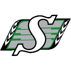
Saskatchewan Roughriders
1985 - 2015
A letter "S" on a green field between two stalks of wheat in white on a black border and with green streaks.


