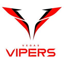
Vegas Vipers
2023 - 2024
A red with black trim letter "V" in the shape of a snake with viper fangs. Wordmark "VEGAS" in red and "VIPERS" in red.
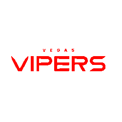
Vegas Vipers
2023 - 2024
Wordmark "VEGAS" and "VIPERS" in red.
Font: vipers
https://font.download/font/velocity-vipers
Vegas Vipers Wordmark Logo History
The Vegas Vipers introduced its wordmark as a central element of franchise branding within the XFL. The Vegas Vipers logo wordmark combined assertive typography with strong color contrast. Black and gold tones conveyed authority, while sharp letterforms reinforced a competitive edge. As part of the XFL Vegas Vipers identity, the wordmark balanced modern aesthetics with long-term brand stability.
In early releases, the Vegas Vipers logo featured bold uppercase lettering designed for clarity across uniforms and digital platforms. Designers refined spacing, alignment, and stroke weight to ensure scalability. Subtle serif details and structured geometry enhanced the professional finish. These adjustments allowed the wordmark to remain consistent while adapting to league-wide branding updates. High-resolution Vipers logo PNG files made the mark accessible for merchandise and media applications.
Today, the Vegas Vipers logo wordmark remains a defining asset of the franchise. It reflects the team’s mission and visual discipline while supporting alternate and primary emblems. For a complete franchise overview, visit the Vegas Vipers History page. You can also explore our Vegas Vipers Primary Logo page to understand how the emblem integrates with the XFL Vegas Vipers identity system.