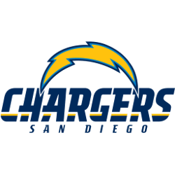
San Diego Chargers 2007 – 2016 The Chargers logo comprises an arc-shaped gold lightning bolt with a powder blue and navy blue outline, making a reference to the remarkable speed, agility, and energy of the team.Chargers Primary LogoChargers Wordmark LogoChargers Team HistoryChargers Alternate Logo The San Diego Chargers have had a long and storied history, with their iconic lightning bolt …
Pittsburgh Steelers Alternate Logo
Pittsburgh Steelers 2002 – Present The Steelers logo consists of three colored (red, yellow and blue) four-pointed astroids stars hypocycloids of four cusps, with the team name Steelers to the left, with a silver ring and a black trim bounding them all. Steelers Primary LogoSteelers Wordmark LogoSteelers Team HistorySteelers Team MerchSteelers Alternate Logo The Pittsburgh Steelers are one of the …
Philadelphia Eagles Alternate Logo
Philadelphia Eagles 1996 – Present The team’s logo changed in 1996, with the eagle limited to a white bald head, drawn in a more cartoon based style. The eagle has determined and aggressive attack look with mouth open. The logo has a silver border to give it a 3-D look. The current logo has a hidden “E” on the neck …
New York Jets Alternate Logo
New York Jets 2024 – Present A wordmark “JETS” in gotham green italicized lettering with a green silhouette of a jet across the top. A new style of font, the shade of green, changes to the letter “E” and the shape of the jet. Jets Primary LogoJets Wordmark LogoJets Team HistoryJets Team MerchJets Alternate Logo The New York Jets are …
New York Giants Alternate Logo
New York Giants 2000 – Present In the 2000 season, an updated stylized blue and red trim lowercase “ny” returned as the primary logo. Controversy surrounded the change because the team remained in New Jersey. Giants Primary LogoGiants Wordmark LogoGiants Team HistoryGiants Team MerchGiants Alternate Logo The New York Giants are one of the most iconic teams in the NFL, …
New Orleans Saints Alternate Logo
New Orleans Saints 2017 – Present Old gold fleur-de-lis with multiple black and white outlines. Shade of old gold altered slightly for the 2017 season. Saints Primary LogoSaints Wordmark LogoSaints Team HistorySaints Team MerchSaints Alternate Logo The New Orleans Saints alternate logo has a long and storied history. It was first introduced in 1967 when the team began playing in …
Boston Patriots Alternate Logo
Boston Patriots 1961 – 1971 From 1961 to 1992, the Patriots used the logo of a Revolutionary War minuteman hiking a football. “Pat Patriot,” the cartoon of a Minuteman preparing to snap a football drawn by the Boston Globe’s Phil Bissell, was chosen as the team’s logo.Patriots Primary LogoPatriots Wordmark LogoPatriots Team HistoryPatriots Alternate Logo The Boston Patriots have a …
New England Patriots Alternate Logo
New England Patriots 2000 – Present The New England Patriots unveiled a new logo in 2000 which depicts a silver patriot with a red and navy blue striped hat. The 2000 logo is a mirror image of the one designed in 1993, though a few changes have been made, the deepening of the blue shade. Patriots Primary LogoPatriots Wordmark LogoPatriots …
Minnesota Vikings Alternate Logo
Minnesota Vikings 2013 – Present Again in 2013, the Vikings changed their primary logo to show the profile of a Viking with long gold, braided hair, a large mustache, and bushy eyebrows wearing a gold and purple helmet with two white horns, one on either side of the helmet. The Vikings have used this logo in varying color schemes since …
Miami Dolphins Alternate Logo
Miami Dolphins 2018 – Present An aqua and marine-blue dolphin swimming in front of a coral sunburst. A new shade of coral orange. Dolphins Primary LogoDolphins Wordmark LogoDolphins Team HistoryDolphins Team MerchDolphins Alternate Logo The Miami Dolphins have had an alternate logo since the team’s inception in 1966. The original logo was a simple white and aqua dolphin head with …