Colorado Rockies 1977 – 1982 The Scouts became the Rockies, named after the mountainous region. The logo consists of the Colorado state flag drawn into the shape of a blue mountain with a red “C” and a yellow dot in the middle.Rockies Alternate LogoRockies Wordmark LogoRockies Team HistoryRockies Primary Logo The Colorado Rockies are a professional ice hockey team based …
New Jersey Devils Primary Logo
New Jersey Devils 2000 – Present The Devils’ logo is a monogram of the letters “N” and “J” rendered with devil horns at the top of the “J” and a pointed tail at the bottom. The logo sits inside an open black circle, and lies on a field of white. Devils Wordmark LogoDevils Team HistoryDevils Team MerchDevils Primary Logo The …
Nashville Predators Primary Logo
Nashville Predators 2012 – Present This logo is a slightly different take on the original, with an altered color scheme and simpler design. Also, the tiger’s eye now has a more distinct pupil. The logo features the side head shot of the saber-toothed tiger with blue and gold highlighted features and a gold trim around the logo. Predators Alternate LogoPredators …
Montreal Canadiens Primary Logo
Montreal Canadiens 2000 – Present The change to the current logo is again a closed red letter “C,” with its top and bottom edges curling into each other in a symmetrical shape. The “C” and the “H” are fused together. All enclosed by a thick blue outline. Canadiens Wordmark LogoCanadiens Team HistoryCanadiens Team MerchCanadiens Primary Logo The Montreal Canadiens are …
Minnesota Wild Primary Logo
Minnesota Wild 2014 – Present The new and cleaner head of a black bear created using Minnesota-area scenery, green pine trees, a wheat colored river, a red sky, yellow sun set and white shooting star. The wordmark “Minnesota Wild” was removed from the previous logo. Wild Alternate LogoWild Wordmark LogoWild Team HistoryWild Team MerchWild Primary Logo The Minnesota Wilds’ primary …
Los Angeles Kings Primary Logo
Los Angeles Kings 2025 – Present A throwback logo to the one used by the club from 1988 to 1998. A wordmark “KINGS” in black italic with white highlight with black speed lines on a silver with white and black trim banner over a crown in black, and a wordmark “Los Angeles” is black on top. Kings Alternate LogoKings Wordmark …
Florida Panthers Primary Logo
Florida Panthers 2016 – Present The new Panthers primary logo includes a more mature and stoic panther inside a shield with “Florida” set in a tab across the top of the mark. Panthers Alternate LogoPanthers Wordmark LogoPanthers Team HistoryPanthers Team MerchPanthers Primary Logo The Florida Panthers’ primary logo has a long and storied history. The first iteration of the logo …
Edmonton Oilers Primary Logo
Edmonton Oilers 2023 – Present The Oilers’ wordmark “OILERS” is in blue in the original custom font, as well as the encompassing blue ring, and the oil drop is orange in the top center. Colors to rematch their original 1979 team colors of royal blue and orange. Oilers Alternate LogoOilers Wordmark LogoOilers Team HistoryOilers Team MerchOilers Primary Logo The Edmonton …
Detroit Cougars Primary Logo
Detroit Cougars 1927 – 1930 The final logo for the Detroit Cougars consists of the carrier over the letter Old English white “D” now on a red shield. The letter “D” stands for the city of Detroit.Cougars Team HistoryCougars Primary Logo The Detroit Cougars are one of the oldest teams in the NHL, and their primary logo has a long …
Detroit Falcons Primary Logo
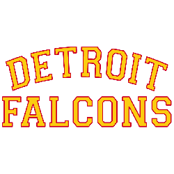
Detroit Falcons 1931 – 1932 Trying to change their fortunes, the Cougars name was changed in 1930 – 1931 to the Detroit Falcons. The logo is a simple wordmark “DETROIT” arched over “FALCONS” in yellow with red trim.Falcons Team HistoryFalcons Primary Logo The Detroit Falcons were a professional hockey team that played in the National Hockey League (NHL) from 1930 …

