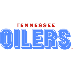
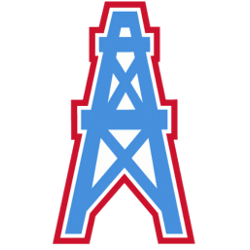
Oilers Wordmark Logo The Houston Oilers were a professional American football team that played in the National Football League from 1960-1996. The team was based out of Houston, Texas, and had some memorable moments throughout their thirty-six-year history. One of the most iconic aspects of this franchise is its logo and wordmark, which have remained relatively unchanged since its inception …
Tennessee Oilers Wordmark Logo
Oilers Wordmark Logo The Tennessee Oilers have a long and storied history in the National Football League (NFL). The team was founded as the Houston Oilers in 1960 but moved to Nashville, Tennessee after the 1996 season. Since then, they have been known as the Titans. Throughout their time in both cities, they had several logos and wordmarks that represented …
Edmonton Oilers Wordmark Logo
Oilers Wordmark Logo The Edmonton Oilers are one of the most recognizable hockey teams in the world, and their iconic logo has been an integral part of their identity since they were founded in 1972. The original Oilers logo was a blue circle with white trim and two crossed oil derricks. This design served as the team’s primary logo until …
Alberta Oilers Primary Logo
Oilers Primary Logo The Edmonton Oilers have had a storied history in the NHL since their inception in 1972. One of the most iconic symbols associated with this team is its primary logo, which has gone through many iterations over the years. The original logo was designed by an artist named Bruce Smith and featured a blue circle with orange …
Edmonton Oilers Alternate Logo
Oilers Alternate Logo The Edmonton Oilers’ alternate logo history is a long and storied one. The team has had several different logos, each with its unique look and feel. From their original blue-and-orange logo to their current black-and-silver design, the Oilers have consistently kept up with modern trends while still paying homage to their past. The first alternate logo for …
Tennessee Oilers Alternate Logo
Oilers Alternate Logo The Tennessee Oilers’ alternate logo history is an interesting one. It began in 1997 when the team relocated from Houston, Texas, to Nashville, Tennessee, and adopted the name “Tennessee Oilers.” The original logo featured a navy blue circle with a white outline of the state of Tennessee inside it. The words “TENNESSEE OILERS” were written in bold …
Edmonton Oilers Primary Logo
Oilers Primary Logo The Edmonton Oilers have a long and storied history, and their primary logo has been an essential part of that. The first logo was introduced in 1972 when the team joined the World Hockey Association (WHA). It featured a blue circle with an orange oil derrick inside it and two white stars on either side. This simple …
Houston Oilers Primary Logo
Oilers Primary Logo The Houston Oilers’ primary logo has a long and storied history, dating back to its inception in 1960. The original logo featured an oil derrick with the words “Houston Oilers” written across it in white letters. This design was used until 1965, when a more modern-looking blue star replaced it with red trim and white lettering that …
Tennessee Oilers Primary Logo
Oilers Primary Logo The Tennessee Oilers’ primary logo has a long and storied history, dating back to the team’s inception in 1997. The original logo featured an oil derrick with three stars above it, representing the state of Tennessee. This design was meant to symbolize the team’s connection to its home state and its commitment to energy production. In 1999, …