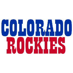
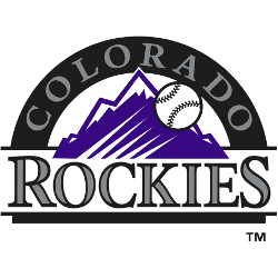
Welcome to the MLB NL West Logo Battle, where fans can vote for the top team logos in the division. From the Dodgers to the Rockies, each logo tells a story of history, identity, and regional pride. Cast your vote and help determine which design stands out as the ultimate fan-favorite logo in the NL West.MLB Logo BattlesMLB Logo BattleAL …
Colorado Rockies Logo History (Devils) – Wordmark Logo
The Colorado Rockies logo shines in the team’s wordmark logo collection, evolving since 1976 in the NHL. Its sleek text reflects Colorado’s rugged spirit. Therefore, the Colorado Rockies hockey team captivates collectors. Moreover, the Colorado Rockies NHL logo showcases vibrant identity and regional pride.Colorado Rockies 1977 – 1982 The Scouts became the Rockies, named after the mountainous region. The logo …
Colorado Rockies Logo History – Wordmark Logo
The Colorado Rockies wordmark logo collection celebrates the team’s bold MLB legacy. Featuring sleek mountain-inspired script, the Colorado Rockies logo ignites team spirit. This collection highlights team history, uniting fans with the vibrant heritage of Colorado Rockies MLB baseball. Colorado Rockies 2017 – Present A classic letter linked “CR” in silver with a thick black trim. The letter “CR” represent …
Rockies Switch Logos
For 2017, the Colorado Rockies go “old school” with the change of their logos. What! We are going back to the old style of major league baseball logos from the ’40s, ’50s or ’60s. The classic Detroit Tigers olde English letter “D” or the New York Yankees interlocked letters “NY” logos have been around for decades. The Rockies have not …
Colorado Rockies Logo History – Alternate Logo
The Colorado Rockies alternate logo collection showcases the team’s bold MLB legacy. Featuring rugged mountain and baseball designs, the Colorado Rockies logo enhances team spirit. This collection highlights Colorado Rockies logo history, uniting fans with the vibrant tradition of Colorado Rockies MLB. Colorado Rockies 2017 – Present A classic letter linked “CR” in silver with a thick black trim. The …
Colorado Rockies Logo History (Devils) – Alternate Logo
The Colorado Rockies logo shines in the team’s alternate logo collection, evolving since 1976 in the NHL. Its bold mountain design reflects Colorado’s rugged spirit. Therefore, the Colorado Rockies hockey team captivates collectors. Moreover, the Colorado Rockies NHL logo showcases vibrant identity and regional pride.Colorado Rockies 1977 – 1982 The Scouts became the Rockies, named after the mountainous region. The …
Colorado Rockies Logo History – Primary Logo
The Colorado Rockies primary logo captures the team’s rugged MLB spirit. With its bold mountain design, the Colorado Rockies logo reflects Denver’s pride. This collection of primary logos unites fans, showcasing the Colorado Rockies MLB legacy at Coors Field. Colorado Rockies 2017 – Present A classic letter linked “CR” in silver with a thick black trim. The letter “CR” represent …
Colorado Rockies Logo Devils – Primary Logo
The Colorado Rockies logo leads the team’s primary logo collection, shining in the NHL from 1976 to 1982. Its bold mountain design reflects Colorado’s rugged terrain. Consequently, the Colorado Rockies hockey team’s emblem captivates fans, showcasing the Colorado Rockies logo’s historical depth and regional pride.Colorado Rockies 1977 – 1982 The Scouts became the Rockies, named after the mountainous region. The …


