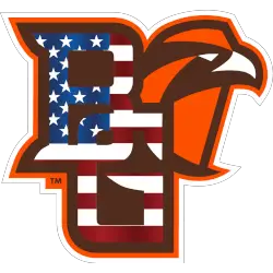
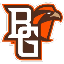
This page documents the complete Bowling Green Falcons logo history with a focus on alternate designs used across different periods. Each Bowling Green Falcons Alternate logo supports branding beyond primary marks. These Bowling Green Falcons logo PNG alternate logos are shown from the program’s early years through the current era. Bowling Green Falcons 2011 – Present A brown, white and …
Bowling Green Falcons Logo History – Primary Logo
This page presents the complete Bowling Green Falcons logo history, focusing on official primary designs. Each Bowling Green Falcons Primary logo represents the team’s visual identity across different eras. These Bowling Green Falcons logo PNG images are displayed from the program’s early years through the present day. Bowling Green Falcons 2011 – Present A brown, white and orange side view …
Air Force Falcons Logo History – Alternate Logo
The Air Force Falcons logo history includes several alternate designs created to support the primary identity. Each Air Force Falcons alternate logo offered flexibility while maintaining tradition. This page documents all alternate versions from the beginning and explains how each Air Force Falcons logo PNG evolved alongside the program’s visual identity. Air Force Falcons 2020 – Present The initials “AF” …
Air Force Falcons Logo History – Primary Logo
The Air Force Falcons logo history reflects the identity of a program rooted in discipline and tradition. The Air Force Falcons primary logo has represented strength and precision across decades. This page documents every primary logo version and explains how the Air Force Falcons logo PNG evolved from the beginning to the present day. Air Force Falcons 2020 – Present …
Atlanta Falcons Logo History – Wordmark Logo
The Atlanta Falcons logo wordmark features a bold, angular typeface that mirrors the speed and aggression of the team’s visual identity. Typically shown in black or red, the wordmark uses extended block letters with slight slants. This strong style fits perfectly with the team’s fast-paced image. As seen in Atlanta Falcons logo history, the font choice is a key brand …
Atlanta Falcons Logo History – Alternate Logo
The Atlanta Falcons logo has always embodied speed, aggression, and Southern grit. While the primary bird design introduced in 2003 is widely recognized, the team has also rolled out alternate logos over the years. These variations often feature stylized falcon heads, wings, or bold monograms. Each alternate design expands on the team’s visual language, adding layers of identity beyond the …
Atlanta Falcons Logo History – Primary Logo & PNG
The Atlanta Falcons logo is a bold symbol of strength and speed, perfectly reflecting the team’s fierce identity. Introduced in 1966 and modernized over the years, the Atlanta Falcons logo history showcases a sleek evolution that fans proudly recognize. Today’s design features a stylized falcon in mid-attack, forming an “F” shape. Atlanta Falcons 2003 – Present The Atlanta Falcons team …


