There are not many team logos that have endured the test of time. Almost every franchise, team, and club has undergone changes or modifications to its logo over time. The Atlanta Falcons are a professional football team in the NFL. You may be surprised to learn that the Atlanta Falcons have yet to win a championship, but they have a …

Unveiling the Stories Behind Sports Logos
Logos are an integral part of any sports team’s identity and brand. The logo represents the history, values, and spirit of the organization. Sports fans form an instant, almost spiritual, connection to the logos of their favorite teams. These iconic symbols transcend mere images to become an indelible representation of the sports franchises we passionately support. Let’s explore why sports …
Evolution and History of the Atlanta Falcons Logo
Since its inception in 1965, the Atlanta Falcons have held a significant position in professional football. As the team’s emblem evolved over the years, its transformations have played a role in molding its identity and symbolizing its ethos. Lamar Dodd, a renowned artist from Georgia, designed the team’s original logo. It embodied ferocity, encapsulating a black falcon with menacing red …
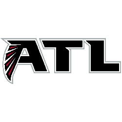
Falcons Incorporate “ATL” Design Into Updated Look
The Atlanta Falcons will be one of about a half dozen teams this next NFL season (whenever and wherever it takes place) with a new on-field look. While the Dirty Birds will maintain their longtime primary logo (a form of it has been used for the franchise’s entire existence – since 1996) and black, red, and white color scheme, they …

Atlanta Falcons Logo History – Wordmark Logo
The Atlanta Falcons logo wordmark features a bold, angular typeface that mirrors the speed and aggression of the team’s visual identity. Typically shown in black or red, the wordmark uses extended block letters with slight slants. This strong style fits perfectly with the team’s fast-paced image. As seen in Atlanta Falcons logo history, the font choice is a key brand …
Atlanta Falcons Logo History – Alternate Logo
The Atlanta Falcons logo has always embodied speed, aggression, and Southern grit. While the primary bird design introduced in 2003 is widely recognized, the team has also rolled out alternate logos over the years. These variations often feature stylized falcon heads, wings, or bold monograms. Each alternate design expands on the team’s visual language, adding layers of identity beyond the …
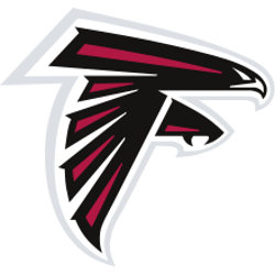
Atlanta Falcons Logo History – Primary Logo & PNG
The Atlanta Falcons logo is a bold symbol of strength and speed, perfectly reflecting the team’s fierce identity. Introduced in 1966 and modernized over the years, the Atlanta Falcons logo history showcases a sleek evolution that fans proudly recognize. Today’s design features a stylized falcon in mid-attack, forming an “F” shape. Atlanta Falcons 2003 – Present The Atlanta Falcons team …