Seattle Dragons
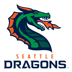
A side view of a green, blue, and orange dragon breathing orange fire. Wordmark “SEATTLE” in orange and “DRAGONS” in blue.
Dragons Wordmark Logo
Since its inception, this logo has been widely embraced by fans of both footballs as well as other sports teams in Seattle such as Major League Soccer's Sounders FC or NBA's Sonics (now Thunder). It is often seen on merchandise around town including hats, t-shirts, and jerseys; but more importantly, it serves to represent not only one team but rather an entire city united behind them under one banner: “Go Dragons!”
In addition to being popular among fans for its aesthetics alone; many supporters take pride in knowing that this symbol helps bring attention to their beloved hometown whenever they see it displayed across various media outlets like television broadcasts or social media posts about upcoming games/events involving the franchise itself or any related news stories pertaining thereto. This type of recognition can be invaluable for any organization looking to maximize exposure within local markets - something which makes sense considering how successful these past few years have been since adopting said emblematic look back in 2019!

Seattle Dragons
2020 - 2023
Wordmark "SEATTLE" in orange and "DRAGONS" in blue.
Font: Unknown


