San Francisco Demons
Horned Deamon’s head in black and white with a red outline. Wordmark “DEMONS” in black on the demons head.
San Francisco Demons
2001
Horned Demon's head in black and white with a red outline.
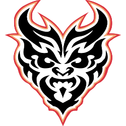
San Francisco Demons
2001
A horizontal demon's pitch fork in black with a red flame surrounding the fork.

San Francisco Demons
2001
A horizontal demon's pitch fork in red with black and copper.

San Francisco Demons
2001
A vertical demon's pitch fork in yellow.

San Francisco Demons Alternate Logo
The San Francisco Demons logo system reflected the energy and creativity of early-2000s professional football branding. As part of the XFL, the San Francisco Demons football franchise introduced alternate designs that emphasized bold graphics and stylized demon imagery. These secondary marks supported the primary emblem while offering flexibility for merchandise and promotional materials throughout the San Francisco Demons XFL season.
Alternate versions of the San Francisco Demons logo often focused on simplified layouts and high-contrast color schemes. Designers refined visual elements to improve scalability across uniforms, broadcast graphics, and licensed products. This approach ensured consistent recognition of the San Francisco Demons football brand while maintaining alignment with professional sports marketing standards of the era.
Although the league operated briefly, the alternate branding remains an important chapter in San Francisco Demons logo history. The designs captured the aggressive and competitive spirit associated with XFL football while contributing to fan engagement. For complete franchise background, visit the San Francisco Demons History page. You can also explore our San Francisco Demons Wordmark Logo page to review the typographic identity that complemented the alternate system.
Football Sports Fan Products