
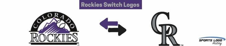
 For 2017, the Colorado Rockies go “old school” with the change of their logos. What! We are going back to the old style of major league baseball logos from the ’40s, ’50s or ’60s. The classic Detroit Tigers olde English letter “D” or the New York Yankees interlocked letters “NY” logos have been around for decades. The Rockies
have not been around for decades, but now their logo has gone back to the ’40s.
The Rockies are making their primary logo their alternate logo and moving their alternate logo to their primary logo. Are you confused?
Colorado Rockies Alternate Logo 2017 - Present
Don’t be, it's just a straightforward switch. The former Rockies' primary logo has been the team's primary logo since their expansion year in 1993. Their former alternate logo (now the new primary logo) has been around since the beginning in 1993 as well.
There has been no explanation for why the Rockies made this change this spring, making it difficult to understand this unprecedented logo move. To my knowledge, no team has ever made such a change to their logos.
With a promising year ahead for the Rockies, this is a great time to make a change. I am not sure they made the right change.