Orlando Rage
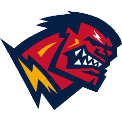
Head of man in “RAGE” gritting his teeth and turning red with a yellow lightning at his neck.
Orlando Rage
2001
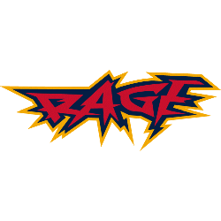
Wordmark "RAGE" in red with yellow trim on a blue background in a edgy custom font.
Font: Custom
Orlando Rage Wordmark Logo History
The wordmark logo of the Orlando Rage served as a core branding element within the Orlando Rage XFL logo system. Designers focused on bold typography and structured letterforms to convey competitive strength and professional sports identity. The Orlando Rage wordmark logo appeared across uniforms, merchandise, and promotional materials, reinforcing recognition throughout the 2001 season.
Color and spacing decisions played an important role in the typographic design. High-contrast layouts ensured readability across print and broadcast media, while balanced proportions maintained visual cohesion with the primary emblem. The Orlando Rage XFL logo identity system combined these elements to create a unified brand presence in early-2000s football marketing.
Although the franchise operated briefly, the wordmark remains a significant chapter in Orlando Rage logo history. The design reflected professional sports branding trends of the era and contributed to team recognition among fans. For complete franchise background, visit the Orlando Rage History page. You can also explore our Orlando Rage Primary Logo page to understand how typography supported the overall Orlando Rage XFL logo identity.


