New York Guardians
2020 - 2023
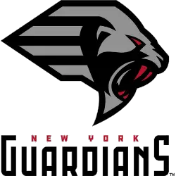
A side view of a black, grey and red gargoyles head with mouth in attack mode. Wordmark "NEW YORK" in red and "GUARDIANS" in black.
New York Guardians
2020 - 2023
A side view of a black, grey and red gargoyles head with mouth in attack mode. Wordmark "NEW YORK" in red and "GUARDIANS" in black.
New York Guardians Logo History
The New York Guardians competed during the 2020 season of the XFL. The New York Guardians logo primary logo featured a stylized gargoyle shield, symbolizing vigilance and defensive power. This bold mark quickly became central to New York Guardians XFL branding and reinforced the team’s protective, warrior-inspired identity.
The emblem used a dark color palette with metallic silver accents to create depth and authority. In addition, the custom New York Guardians font played a major role in visual consistency. The sharp, gothic-style lettering complemented the gargoyle imagery and strengthened overall recognition. As a result, the New York Guardians logo stood out among other New York Guardians XFL identities introduced in 2020.
Although the franchise later transitioned markets, the New York Guardians logo remains a defining symbol of the team’s original era. The balanced combination of shield iconography and distinctive New York Guardians font created a cohesive primary mark. To learn more about the franchise background, view the New York Guardians history page. You can also explore our New York Guardians Alternate Logo page to compare additional branding elements used during the season.