
MLB Logo Battles
MLB History
Baseball Sports Fan Products


MLB - AL East Logo Battle
The MLB AL East Logo Battle highlights some of the most recognizable logos in baseball. Each team in the division features a design that reflects its history and identity. Fans can explore these symbols and vote for the logo that best represents the spirit of the AL East.
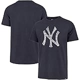
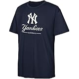
The New York Yankees present their famous interlocking “NY” logo. The design is simple, yet powerful. It represents tradition, success, and one of the most recognizable brands in sports.
Meanwhile, the Boston Red Sox showcase their classic pair of red socks logo. The design connects directly to the team’s name and long history. In addition, it remains a beloved symbol for fans in Boston and beyond.
The Toronto Blue Jays feature a modern blue jay head with a red maple leaf accent. This design highlights the team’s Canadian identity. As a result, it stands out as one of the most distinctive logos in the division.
The Baltimore Orioles display their cheerful cartoon bird logo. The design brings personality and charm to the franchise. Moreover, its playful style has made it a fan favorite for decades.
Finally, the Tampa Bay Rays use a sleek and contemporary logo with a bright sunburst. The design reflects Florida’s sunny environment and fresh energy. Therefore, it represents the modern identity of the franchise.
Together, these designs combine tradition, creativity, and regional pride. The MLB AL East Logo Battle allows fans to compare each emblem and vote for the logo that best captures the identity and rivalry of the AL East division.