Memphis Maniax
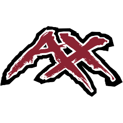
Red with white and black trim letters “AX” shaped into a letter “M” in a edgy font.
Maniax Wordmark Logo
The Memphis Maniax was a professional American football team that played in the XFL from 2001 to 2002. The team was based in Memphis, Tennessee, and had a unique wordmark logo which has become an iconic symbol of the franchise. The original version of the logo featured red lettering with black outlining on an orange background, giving it an eye-catching design.
The primary purpose of this bold design was to make sure that fans could easily recognize their favorite team when they saw them playing on television or at games. This worked out well as many people have come to associate this particular wordmark with the Maniax, even though they are no longer around today. In addition to its memorable look, there is also some interesting history behind it as well; according to reports from ESPN and other sources, former head coach Mike Ditka personally designed this logo himself before he left his position after just one season!
While most teams tend not to stay around very long in professional sports leagues like the XFL did not last much more than two seasons either), thanks largely due its distinct branding efforts – including its iconic wordmark –the Memphis Maniax will always be remembered by those who followed them during their short time in existence.
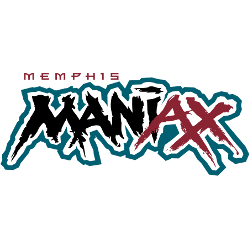
Memphis Maniax
2001
Red with white trim letters "AX" and black with white trim "MANI" in a edgy font with a teal trim around the whole wordmark. Wordmark "MEMPHIS" in red above.
Font: Custom
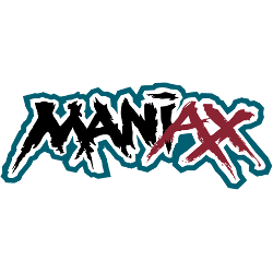
Memphis Maniax
2001
Red with white trim letters "AX" and black with white trim "MANI" in a edgy font with a teal trim around the whole wordmark.
Font: Custom

Memphis Maniax
2001
Red with white trim letters "AX" and black with white trim "MANI" in a edgy font with a yellow trim around the whole wordmark.
Font: Custom


