
Sheffield United FC
BACK again. After a more traditional design based on the council’s crest of arms was used, finally two crossed blades with the white rose of Yorkshire, set in a black shield. A wordmark ” SHEFFIELD UNITED F.C.” and “1889” in white on a red background.
Sheffield United FC Primary Logo
Sheffield United FC is an English football club based in the city of Sheffield, South Yorkshire. The team was founded in 1889 and has a long history associated with its logo designs. Over the years, there have been several changes to the primary logo for Sheffield United FC.
The first iteration of their primary logo dates back to 1900 when it featured a shield with three swords crossed over it and two stars on either side of the shield representing their two League titles at that time. This design remained until 1972 when they introduced a new version that included an eagle as part of its design along with some minor alterations such as changing from red to blue colors and adding more stars around the perimeter signifying additional league titles won by then-current manager Dave Mackay's squad during his tenure at Bramall Lane Stadium (home ground).
In 1997, another revamp was made where they changed both colors again but this time opted for white instead while also introducing a black outline around each element within; this one lasted until 2007 before being replaced once more by what we now know today - featuring just blades/swords along bottom half accompanied by “SHEFFIELD UNITED” lettering above them all set against yellow background inside blue circle shape itself outlined using same color scheme mentioned earlier (black & white). In conclusion, these various iterations throughout decades show how much pride supporters take in maintaining traditional aspects while simultaneously updating their look whenever necessary so that everyone can recognize who you are without sacrificing any originality or identity belonging specifically only to them!
Sheffield United FC
2015 - 2016
Updated version of the original Sheffield logo from the 1800s. The shield depicts a smaller shield in now in white with three wheat stacks and a lion above the shield. Initials "SUFC" positioned around the shield in white on a red background.

Sheffield United FC
2014 - 2015
Sheffield's 125th annaversity logo bring back the original logo from 1889. Added above the original logo is "125" in gold and "YEARS OF SUFC" above the shield and below the shield "1889 - 2014" in black. The shield depicts a smaller shield in gold with three wheat stacks and a lion above the shield. Initials "SUFC" positioned around the shield in gold on a red background.
Sheffield United FC
1999 - 2014
In 1999, the Blades brought back the popular 1977 badge. After a more traditional design based on the council’s crest of arms was used, finally two crossed blades with the white rose of Yorkshire, set in a black shield. A wordmark " SHEFFIELD UNITED F.C." and "1889" in white on a red background.
Sheffield United FC
1987 - 1999
The 1987 shield for Sheffield is another design change from the very popular design. Now black shield with red trim has the criss-cross blades and the white rose center in the shield. Wordmark "SHEFFIELD UNITED" in white and "1889" at the bottom.

Sheffield United FC
1977 - 1987
It wasn’t until the 1977 season that the Blades revealed a badge that was seen as a design classic. After a more traditional design based on the council’s crest of arms was used, finally two crossed blades with the white rose of Yorkshire, set in a black shield. A wordmark " SHEFFIELD UNITED F.C." and "1889" in white on a red background.
Sheffield United FC
1970 - 1977
New design in the '70s with a roundel logo featuring a blue and green shield with three gold wheat bales and two blades. Encircled wordmark "SHEFFIELD UNITED FC 1889" in gold.
Sheffield United FC
1965 - 1970
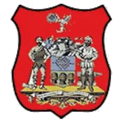
In 1965, a red with black trim shield was added to a new version of the Sheffield coat of arms.
Sheffield United FC
1952 - 1965
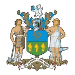
The lion on the crest is taken from the Arms of the Dukes of Norfolk, lords of the manor of Sheffield; it appeared also in the Arms of the Talbot family, their predecessors in the lordship. The sheaf of arrows was the main motif in the seals of the Burgery of Sheffield and the Twelve Capital Burgesses, the two bodies which bore the brunt of local government in Sheffield before the creation of the Borough. The three wheatsheaves on a green field were probably chosen at the College of Arms as a play upon the name Sheffield which means "the open space by the River Sheaf."
Sheffield United FC
1890 - 1952
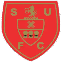
The original shield for Sheffield began in the 1800s. The shield depicts a smaller shield in gold with three wheat stacks and a lion above the shield. Initials "SUFC" positioned around the shield in gold on a red background.
College Sports Fan Products


