AFC Bournemouth
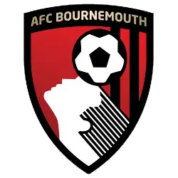
In 2013, we get an updated version of AFC Bournemouth’s crest. Now with a classy looking shield with the continuation of football and the player’s head in black and white on a red and black background. Above the football is a golden wordmark “AFC BOURNEMOUTH” across the top.

AFC Bournemouth
1988 - 2013
Bringing back the version from 1974 of the similar shield, football and players head. Added below the shield is a white with black trim banner with a wordmark "AFC Bournemouth" in red.

AFC Bournemouth
1983 - 1988
The simplified continued in 1983 with changed versions on shield, football and the players head. Added a red background and removed the circle and initials.
AFC Bournemouth
1981 - 1983
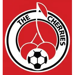
During the 1980s the crest design shortly featured two intertwined cherries and a black and white football, Bournemouth having earned this nickname due to the colors of their kit, and Dean Court originally being built next to a cherry orchard.
AFC Bournemouth
1974 - 1981
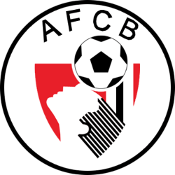
In the 1974 version of Bournemouth's crest became simplified by adding initials "AFCB" and circle border. The design of shield, football and the player's head stayed.

AFC Bournemouth
1972 - 1974
Today’s crest was first used starting in 1971 and resembles an animation of a player’s head and a football. The silhouette is that of Dicky Dowsett, the former striker and commercial manager of the club who was instrumental in dropping the Boscombe suffix and the design of a new identity.

Bournemouth and Boscombe Athletic FC
1966 - 1972
As the Bournemouth and Boscombe Athletic FC the logo became a simplified mark with the scripted initials of "BFC" in a white diagonal pattern on a red background.
Bournemouth and Boscombe Athletic FC
1936 - 1966
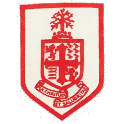
The Bournemouth coat-of-arms was granted as the club’s first crest and was used from 1936 until 1966, as a white and red shield.
"Wear the Badge. Feel the Passion!"
Secure the latest 2026/27 kits, authentic training wear, and official club accessories. Whether you’re cheering from across the pond or traveling to the stadium, rep your club with the same gear the pros wear.
Get Your Kit – Official Premier League Shop

AFC Bournemouth Fans, Time to Make Your Mark!
Click to go to Premier Logo Battle and vote
AFC Bournemouth Logo History
The AFC Bournemouth logo history officially began with the civic coat of arms of the town. This regal shield was used for decades until the club rebranded in 1971. In 1972, the team introduced its most famous AFC Bournemouth logo featuring a player heading a ball. This silhouette honors Dickie Dowsett, a prolific striker who also served as the club's commercial manager. Modern versions of the AFC Bournemouth logo PNG maintain this iconic imagery but include updated gold lettering to reflect the club's top-flight status.
Furthermore, the club briefly experimented with other designs during the early 1980s. This period saw an alternate AFC Bournemouth logo featuring two intertwined cherries, a direct reference to the team's nickname. However, the club returned to the Dowsett silhouette in 1983 because of its deep popularity among supporters. Check logos of other teams on main Premier League logo page.
Ultimately, the AFC Bournemouth logo history reflects the club's resilience and local pride. By exploring the official AFC Bournemouth history, fans can learn more about the milestones that shaped these emblems. We provide high-quality AFC Bournemouth logo PNG assets to ensure the visual history of the Cherries is preserved for every generation. Whether it is the classic 1970s "heading man" or the modern gold-trimmed shield, each AFC Bournemouth logo represents the passion of the Dean Court faithful.


