Manchester City FC
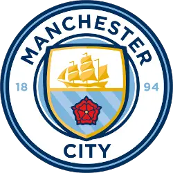
December 26, 2015, Manchester City introduced a new emblem of the club before the match with Sunderland. As promised, the Manchester City logo was designed in a round shape and executed in two colors: 94% of fans preferred the blue color, and 68% – the white one. Also, fans chose the elements of the picture: 85% appreciated a ship, the symbol of Manchester, 67% chose three rivers (Irwell, Irk and Medlock), and 60% picked out a red rose, the symbol of the county of Lancashire. The logo has a round shape again with a shield inside, where the golden ship and the red rose are featured. All the lines are painted in the dark blue color and complemented by light blue. The year of the club foundation is painted blue 1894. Finally, the arched wordmark is back “MANCHESTER CITY” in blue.
Manchester City FC Primary Logo
Manchester City Football Club is a professional football club based in Manchester, England. Founded in 1880 as St. Mark's (West Gorton), they became Ardwick Association Football Club in 1887 and Manchester City F.C. in 1894 before adopting their current name the following year when the club moved to its new home at Maine Road Stadium. The team has enjoyed considerable success throughout its history, most notably winning five League titles, four FA Cups, and two League Cups since 2002 under manager Pep Guardiola’s leadership beginning with his appointment on 1 July 2016; this period also included an unprecedented domestic treble of Premier League title/FA Cup/League Cup wins during 2018-19 season which was completed with victory over Watford FC at Wembley Stadium for the 2019 FA Cup Final trophy win!
The primary logo used by Manchester City FC is one of the oldest logos still used today by any professional sports team - having been adopted back in 1972 when Malcolm Allison first took charge as manager from Joe Mercer's reign that had ended earlier that year after he retired due to ill health issues; it features a circular design featuring three horizontal stripes representing sky blue (top) white (middle) & black or navy blue(bottom). This logo has seen some minor changes over time such as adding MCFC letters within each stripe or changing font styles but remains largely unchanged even after almost 50 years!
In recent times there have been several iterations released including special edition kits for cup finals like the Champions League final kit from the 2011-12 season where they lost out narrowly against Chelsea FC 0:1 score line at Munich Allianz Arena stadium. There have also been collaborations between Nike Inc., who are now the official kit sponsor since 2013 replacing Umbro Ltd., and artists like Stormzy who designed unique tributes commemorating ManCity centenary celebrations last year along with other merchandise products inspired by city skyline outline, etc. These designs all feature the same basic structure & color scheme though slightly altered depending upon the context being celebrated or commemorated making the sure iconic identity of ManCity stays intact while providing fans something fresh every time too!
Manchester City FC
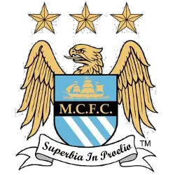
1997 - 2016
Inspired by the urban sign, the developers of the logo also decided to decorate it with a beautiful inscription in Latin.
This badge was based on the arms of the city of Manchester, and consisted of a shield in front of a golden eagle. The eagle is an old heraldic symbol of the city of Manchester. The shield features a ship on its upper half representing the Manchester Ship Canal, and three diagonal stripes in the lower half symbolise the city's three rivers – the Irwell, the Irk and the Medlock. The bottom of the badge bears the motto "Superbia in Proelio", which translates as "Pride in Battle" in Latin. Above the eagle and shield are three stars, which are purely decorative.
Manchester City FC
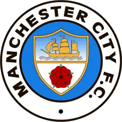
1981 - 1997
For the 1981 season, Manchester kept the same design with some changes to color. The shield has a two tone color of blue and white with the background blue going darker. Still have the arched wordmark "MANCHESTER CITY F.C." in black.
Manchester City FC
1972 - 1981
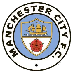
In 1972, Manchester City made significant change to the design and again the colors. Changes to the featured shield by adding a red rose below the yellow ship. The roundel logo now sports a white background for the arched wordmark "MANCHESTER CITY F.C." in black.

Manchester City FC
1970 - 1972
In the beginning of the '70s, Manchester City changed the design and colors to their logo. A black trim was added to the wordmark and the roundel. The featured shield continues with the ship and banner with slight changes.

Manchester City FC
1960 - 1970
Manchester City's first original mark came in the '60s becoming a roundel logo. Bringing over the shield from the coat of arms is the centerpiece. The shield is red and yellow with a ship at the top of the shield and a striped banner at the bottom. Arched wordmark "MANCHESTER CITY FC" in black on a light blue background.
Manchester City FC
1926 - 1960
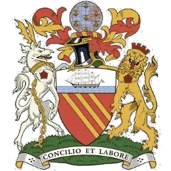
The original crest was gleaned from the Manchester City Coat of Arms logo.
The golden bends in red are derived from the arms of the Lords of Manchester, who ruled the city before 1301. The chief shows a ship in full sail, a symbol of trade and enterprise. The crest shows a globe covered with bees, representing the world to all parts of which the city's goods are exported. The bees are a symbol of activity. The supporters, an antelope and a lion, are derived from the arms of King Henry IV, Duke of Lancaster.
The motto means "By council and work" and is derived from a phrase in Ecclesiasticus 37:16: "Let reason be the beginning of every work and let counsel go before every action."
College Sports Fan Products
Manchester City FC fans can participate in the Premier League Team Logo Battle and show their support for the team! With a chance to win exclusive prizes, this is an exciting opportunity to express your passion for Manchester City and help them come out on top. Show your loyalty by joining in now!


