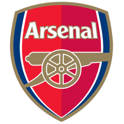
Arsenal FC
A multi-colored shield with a side view of a gold with white trim cannon below a wordmark “Arsenal” in white with gold trim.
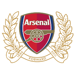
Arsenal FC
2011 - 2012
A new coat of arms in honor of the club’s 125th anniversary was created in 2010. The new Arsenal logo was a combination of the modern and the very first version of 1888. 15 oak leaves symbolize 15 founders who first met at the Royal Oak Pub. Another 15 leaves of the laurel were depicted on sixpenny coins, which the 15 founders put in the general treasury in 1886. Forward is the motto, connected with armament and battles.
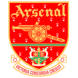
Arsenal FC
2001 - 2002
The crest shifts back to a red with a gold trim featuring a gold cannon below the club's name in gold and above the green coat of arms of the Metropolitan Borough of Islington and a scroll inscribed with the club's newly adopted Latin motto, Victoria Concordia Crescit - "victory comes from harmony" – coined by the club's program editor Harry Homer.
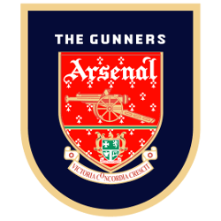
Arsenal FC
1996 - 2001
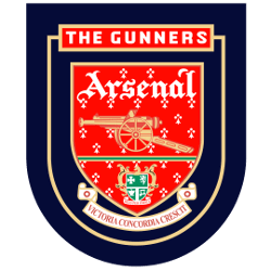
In 1996, the crest continues in black with a gold trim featuring a gold cannon below the club's name in white and above the green coat of arms of the Metropolitan Borough of Islington and a scroll inscribed with the club's newly adopted Latin motto, Victoria Concordia Crescit - "victory comes from harmony" – coined by the club's program editor Harry Homer.
Arsenal FC
1994 - 1996
In 1994, the crest now in black featuring a gold cannon below the club's name in white and above the green coat of arms of the Metropolitan Borough of Islington and a scroll inscribed with the club's newly adopted Latin motto, Victoria Concordia Crescit - "victory comes from harmony" – coined by the club's program editor Harry Homer.
Arsenal FC
1949 - 1994
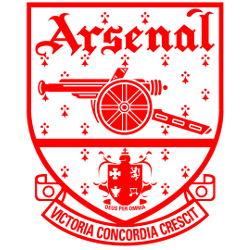
In 1949, the club unveiled a red modernized crest featuring the same style of cannon below the club's name and above the coat of arms of the Metropolitan Borough of Islington and a scroll inscribed with the club's newly adopted Latin motto, Victoria Concordia Crescit - "victory comes from harmony" – coined by the club's program editor Harry Homer.

Arsenal FC
1936 - 1949
A monogram theme was developed into an Art Deco-style badge on which red letters "A" and "C" framed a football rather than the letter F, the whole set within a hexagonal red border.
Arsenal FC
1930 - 1936
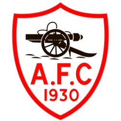
A white with red trim shield with a black cannon above initials "A.F.C" and the year "1930" in red.
Arsenal FC
1925 - 1930
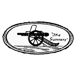
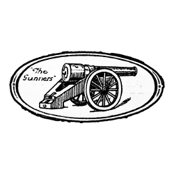
The previous crest only lasted until 1925, when the cannon was reversed to point westward and its barrel slimmed down and still has "The Gunners."
Arsenal FC
1922 - 1925
The club adopted a crest featuring a single cannon, pointing eastwards, with the club's nickname, The Gunners, inscribed alongside it.

Arsenal FC
1888 - 1922
Unveiled in 1888, Royal Arsenal's first crest featured three cannons viewed from above, pointing northwards. These can sometimes be mistaken for chimneys, but the presence of a carved lion's head and a cascabel on each are clear indicators that they are cannons.
Arsenal Logo History: How the Iconic Badge Changed Over Time: Logo History Explored!
In this video, we explore the logo's origins, the meaning behind each design, and how the emblem has become a symbol of pride for millions of fans worldwide. Whether you're an Arsenal supporter or a lover of football history, this comprehensive look at the Arsenal logo's evolution is a must-watch.
"School Spirit Never Graduates"
From the first kickoff to the Final Four, your colors represent a lifetime of memories. Celebrate the traditions that define your campus and rep your alma mater with officially licensed gear for every season.
Shop the Official NCAA Collection

Arsenal FC Fans, Time to Make Your Mark!
Click to go to Premier Logo Battle and vote
Arsenal FC Logo History
The Arsenal FC logo history began with a crest featuring three vertical cannons, representing the club's origins at the Royal Arsenal in Woolwich. In 1949, the team introduced the famous "Victoria Concordia Crescit" shield. This iconic Arsenal FC logo served the Gunners for over fifty years, featuring a westward-pointing cannon and gothic typography. However, the club modernized its brand in 2002 to ensure the Arsenal FC logo PNG was copyrightable and digitally versatile. This transition introduced the vibrant red and gold shield that fans worldwide celebrate today.
Furthermore, the modern Arsenal FC logo simplified the design by featuring a single, eastward-pointing cannon. While the motto was removed from the primary shield, the core spirit of the "Gunners" remains. You can visit our Manchester City logo page to see how other Premier League giants have also embraced minimalist branding. This shift allowed the Arsenal FC logo PNG to stand out on mobile screens and modern jerseys. Because the club values its past, they often release retro collections featuring the 1930s Art Deco "monogram" style.
Ultimately, the Arsenal FC logo serves as a bridge between the club's storied past and its ambitious future. By exploring the official Arsenal FC history, supporters can see the milestones associated with each badge change. We provide a complete gallery of every Arsenal FC logo PNG to help fans and historians study these visual shifts. Each version of the Arsenal FC logo history tells a unique story of resilience, unity, and North London pride. Whether you prefer the classic heraldry or the modern crest, these symbols define the essence of being a Gunner.


