Los Angeles Xtreme
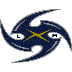
Blue spiral with gold x and small letters “LA” in black.
Los Angeles Xtreme
2001
"X" in the middle of blue letters "LA."
Los Angeles Xtreme
2001
Blue spiral with gold x and small letters "LA" in black. Double wordmark "XTREME" in blue and "LOS ANGELES" in gold.
Los Angeles Xtreme Alternate Logo
The Los Angeles Xtreme competed in the original XFL and introduced distinctive secondary branding. Within Los Angeles Xtreme logo history, the Los Angeles Xtreme alternate logo emphasized intensity through sharp angles, dynamic motion lines, and high-contrast color schemes. These design elements reflected the fast-paced identity of the Los Angeles Xtreme XFL franchise.
Early alternate versions complemented the primary “X” emblem by focusing on streamlined typography and stylized graphic accents. Designers refined outlines, adjusted spacing, and improved color depth to ensure clarity across uniforms and broadcast media. Each Los Angeles Xtreme alternate logo maintained visual consistency while adapting to merchandise and promotional requirements throughout the season.
Although the league lasted only one year, the branding remains significant in Los Angeles Xtreme logo history. The alternate marks helped reinforce recognition during the team’s championship run. For complete franchise background, visit the Los Angeles Xtreme History page. You can also explore our Los Angeles Xtreme Wordmark Logo page to see how typography integrated with the alternate identity system.
Football Sports Fan Products