Dallas Renegades
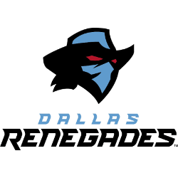
A black, blue, and red headshot of a renegade wearing a blue and black cowboy hat. Wordmark “DALLAS” in blue and “RENEGADES” in black.
Renegades Primary Logo
In 2020, when XFL announced its return after being dormant since 2001, Dallas Renegades unveiled their new primary logo which pays homage to their past but also emphasizes modernity with bold colors and sleek design elements that look great even from afar or up close on any device or screen size. It features an updated version of Todd Klein’s iconic red star which now has been given more depth through embossed details along with five points representing each member of “the family” – players coaches staff management fans alike all supporting this great organization together! Additionally, there is a secondary shield-shaped emblem featuring three stars around a longhorn skull symbolizing courage power & pride – just like what we expect from our beloved renegade players every game day!
Finally at center stage stands “DALLAS RENEGADES” lettering boldly proclaiming our presence within this historic sport & reminding everyone who we are: A TEAM OF CHAMPIONS IN THE MAKING!!! As you can see these logos truly capture what makes us unique - Our spirit never dies no matter how many times life throws us curveballs so let's go out there and show them why they should Fear The Star!!

Dallas Renegades
2020 - 2023
A black, blue and red head shot of a renegade wearing a blue and black cowboy hat. Wordmark "DALLAS" in blue and "RENEGADES" in black.


