Southampton FC
The present badge was designed by a Saints fan back in the early 1970’s It was the result of a competition they had at the time. The halo represents the Saints and the scarf links with the fans. The tree alludes to the nearby New Forest whilst the wavy blue lines refer to the sea and local docks. The white rose is the symbol for Hampshire The Hampshire Rose is widely used in the arms of Hampshire people and places.
Southampton FC Primary Logo
The Southampton Football Club, commonly known as the Saints, is one of the oldest and most successful football clubs in England. With a long and storied history from 1885, they have been a mainstay in English football for over 130 years. The club has always had an iconic logo that captures its identity and reflects its rich history. In this essay, we will take a look at how the primary logo of Southampton FC has evolved throughout its long existence.
The first iteration of Southampton’s primary logo was introduced in 1901 when it became part of the Southern League Division One South Coast side, eventually leading them into The Football League Second Division (now Championship). This original crest featured two crossed swords with “FC” written above them on either side and “SOUTHAMPTON” written underneath it all together inside an oval-shaped boundary line design. This classic badge would stay relatively unchanged until 1957, when some minor changes were made to make it more modern looking, such as changing out fonts used for text within the badge or even adding colors like red & black, which are now considered traditional colors associated with clubs today by fans worldwide. In 1997, another significant change was made to the Saints' crest. Where the old version was replaced by a new one featuring a shield-shaped design composed mainly of three parts: the upper left corner contained a white rose symbolizing the county of Hampshire; the lower right corner showed a sailing ship representing the city's maritime heritage; the top center section displaying St Mary's Church steeple - symbol closely linked with the team since very beginning due their ground located just a few blocks away from church itself! Last but not least, here comes the words "Southampton F C" placed below the whole composition, giving the final touch needed to complete the current official version seen everywhere around the world nowadays, including stadium stands during matches day after day, season after season.
Overall, through different eras, times changed, but the spirit remained the same, making sure every single person connected could recognize their beloved team easily no matter what form they appear under! From humble beginnings up until the present day, the story behind each element incorporated into Primary Logo History continues inspiring generations to come while keeping memories alive forevermore!

Southampton FC
2010
For the clubs 125th anniversary The Saints adopted a commemorative crest for the 2010 season.

Southampton FC
1885 - 1973
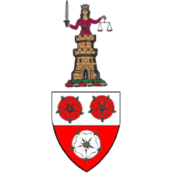
The club’s first badge is a shield and crest taken from the County Borough Council’s arms. The crest shows a golden castle resting on a green mound, with the upper body of a woman rising out of it. She is crowned as a queen and is robed in red with white trimmings. She holds in her right hand a sword of justice and in her left the balance or scales of equity and fairness.
Soccer Sports Fan Products


