Arsenal FC
A multi-colored shield with a side view of a gold with white trim cannon below a wordmark “Arsenal” in white with gold trim.
Arsenal FC
2011 - 2012
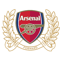
A new coat of arms in honor of the club’s 125th anniversary was created in 2010. The new Arsenal logo was a combination of the modern and the very first version of 1888. 15 oak leaves symbolize 15 founders who first met at the Royal Oak Pub. Another 15 leaves of the laurel were depicted on sixpenny coins, which the 15 founders put in the general treasury in 1886. Forward is the motto, connected with armament and battles.
Arsenal FC
2001 - 2002
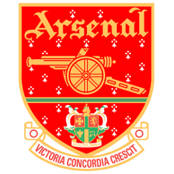
The crest shifts back to a red with a gold trim featuring a gold cannon below the club's name in gold and above the green coat of arms of the Metropolitan Borough of Islington and a scroll inscribed with the club's newly adopted Latin motto, Victoria Concordia Crescit - "victory comes from harmony" – coined by the club's program editor Harry Homer.
Arsenal FC
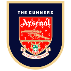
1996 - 2001
In 1996, the crest continues in black with a gold trim featuring a gold cannon below the club's name in white and above the green coat of arms of the Metropolitan Borough of Islington and a scroll inscribed with the club's newly adopted Latin motto, Victoria Concordia Crescit - "victory comes from harmony" – coined by the club's program editor Harry Homer.
Arsenal FC
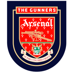
1994 - 1996
In 1994, the crest now in black featuring a gold cannon below the club's name in white and above the green coat of arms of the Metropolitan Borough of Islington and a scroll inscribed with the club's newly adopted Latin motto, Victoria Concordia Crescit - "victory comes from harmony" – coined by the club's program editor Harry Homer.
Arsenal FC
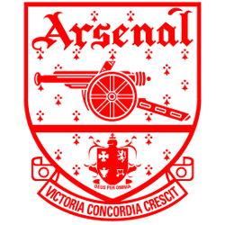
1949 - 1994
In 1949, the club unveiled a red modernized crest featuring the same style of cannon below the club's name and above the coat of arms of the Metropolitan Borough of Islington and a scroll inscribed with the club's newly adopted Latin motto, Victoria Concordia Crescit - "victory comes from harmony" – coined by the club's program editor Harry Homer.

Arsenal FC
1936 - 1949
A monogram theme was developed into an Art Deco-style badge on which red letters "A" and "C" framed a football rather than the letter F, the whole set within a hexagonal red border.
Arsenal FC
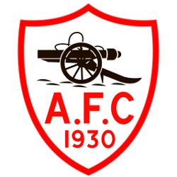
1930 - 1936
A white with red trim shield with a black cannon above initials "A.F.C" and the year "1930" in red.
Arsenal FC
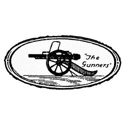
1925 - 1930
The previous crest only lasted until 1925, when the cannon was reversed to point westward and its barrel slimmed down and still has "The Gunners."
Arsenal FC
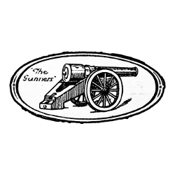
1922 - 1925
The club adopted a crest featuring a single cannon, pointing eastwards, with the club's nickname, The Gunners, inscribed alongside it.

Arsenal FC
1888 - 1922
Unveiled in 1888, Royal Arsenal's first crest featured three cannons viewed from above, pointing northwards. These can sometimes be mistaken for chimneys, but the presence of a carved lion's head and a cascabel on each are clear indicators that they are cannons.
Arsenal Logo History: How the Iconic Badge Changed Over Time: Logo History Explored!
In this video, we explore the logo's origins, the meaning behind each design, and how the emblem has become a symbol of pride for millions of fans worldwide. Whether you're an Arsenal supporter or a lover of football history, this comprehensive look at the Arsenal logo's evolution is a must-watch.
Arsenal FC Primary Logo
Arsenal Football Club is a professional football club based in North London, England. The club has been around since 1886 and has gone through many changes over the years, including its primary logo. The Arsenal FC primary logo history reveals an interesting story of how the team’s image evolved from its humble beginnings to where it stands today.
The original crest featured three cannons on a shield with two crossed swords below it and the words 'Victoria Concordia Crescit' above it meaning “victory comes through harmony” in Latin. This emblem was used until 1949 when they changed their name to Arsenal Football Club Ltd., which led them to update their crest as well by adding red stars along with some minor modifications such as replacing Victoria Concordia Crescit with "Forward". This new version would be used for nearly 40 years before being replaced again in 1988 by another design that included four cannon barrels instead of three, more intricate detail within each barrel, and still had red stars at either side of the shield along with “Forward” inscribed across it once again but this time is written out much larger than before.
This latest version remains largely unchanged up until now except for one small alteration made back in 2002 when they decided to remove any reference whatsoever regarding what company owned them so that all focus could remain solely on Arsenal itself rather than who owns them financially or otherwise; thus leaving us only with just four cannon barrels encased inside a circular border surrounded by eight-pointed star-like shapes representing unity among players & fans alike while also maintaining Forward underneath everything else like always but this time wrote much smaller than ever before.
In conclusion, we can see how far arsenal has come since first introducing themselves into English football way back in 1886; not only have they become one of Europe's most successful teams both domestically & internationally but also managed to keep up appearances too thanks largely due their iconic Primary Logo History which continues evolve even further every single year!
College Sports Fan Products
