West Ham United FC
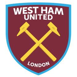
In 2014, the Premier League club West Ham marked the move to the Olympic Stadium with a new emblem. Based on the traditional club colors, the new West Ham logo has a simpler and more streamlined form. The iconic image of the hammers is located in the center of the emblem and painted in golden color. Double-lined arched wordmark “WEST HAM UNITED” in white and below the hammers “LONDON” in white.
West Ham United FC
1999 - 2016
In 1999, the West Ham emblem was significantly redesigned and updated by the London-based design agency Springett Associates. The fortress became yellow and wider with fewer cross-shaped loopholes. Also, the peaked ends of the towers disappeared. Designers changed the shape of the hammers, edging and other small details in order to give the logo more solidity. A banner with an arched wordmark "WEST HAM UNITED" in white on a maroon with blue background.
West Ham United FC
1987 - 1999
In 1987 West Ham United went back to a former design from 1983 and added a new color of red. The castle in yellow with white crosses and the criss-cross hammers on a red background. Below the shield is a blue with yellow trim banner and the wordmark "WEST HAME UNITED F.C." in yellow.
West Ham United FC
1983 - 1987
Back to simple, in 1983 changed to just the criss-cross hammers in white and initials below "W.H.U.F.C." in white on a maroon background.
West Ham United FC
1980 - 1983
A new coat of arms look for West Ham United. New design for the castle, now in yellow with white crosses and the criss-cross hammers. Below the shield is a blue with yellow trim banner and the wordmark "WEST HAME UNITED F.C." in yellow.
West Ham United FC
1975 - 1980
New look for West Ham using a maroon circle as the background. A newly designed white castle is centered with light blue criss-cross hammer.
West Ham United FC
1968 - 1975
New shield has a white with red trim castle and criss-cross hammers. Below the shield is a white with red trim banner with a wordmark "WEST HAM UNITED F.C." in red.
West Ham United FC
1965 - 1968
Bringing back a former shield shape from 1964, however with a new wordmark. Below the castle and hammers wordmark "E.C.WC. WEMBLEY 1965" in white.
West Ham United FC
1964 - 1965
The shield design changed and added is a castle and wordmark. Light blue background with a blue with maroon trim castle is centered with criss-cross hammers. Wordmark below "WEMBLEY 1964" in maroon.

West Ham United FC
1963 - 1964
In 1963, West Ham drops the light blue color and change back to the shield design. Maroon criss-cross hammers again are centered on a white background.

West Ham United FC
1958 - 1963
In 58' West Ham's emblem made only slight changes. The maroon trim has been shorten, to not be around the edges. The criss-cross hammers are featured on a light blue background.
West Ham United FC
1952 - 1958
In 1952, the shield design change to a badge shape shield. Continuing with the same colors and hammers.

West Ham United FC
1950 - 1952
The 50' to 52' emblem's shield design was changed. The criss-cross hammers are featured on a light blue background.

West Ham United FC
1923 - 1950
It was in 1923 that the team adopted its current name, West Ham United, and a logo with the two crisscrossed hammers that have been present on the crest. The hammers emblem was inspired by the team’s nickname, the Hammers, which was derived from the hammers used by shipbuilders.
Thames Ironworks FC
1895 - 1923
The original crest was based on the flag of the UK. Above the flag is the initials "TIW" in white and "FC" below the flag.
West Ham United Primary Logo
West Ham United Football Club is a professional football club based in East London, England. Founded in 1895 as Thames Ironworks FC, the club has been through many changes since then and currently plays its home matches at the London Stadium. One of these changes was to their primary logo which has gone through several iterations throughout West Ham’s history.
The first iteration of West Ham’s primary logo featured an image of two crossed hammers with a shield containing three heraldic symbols: a castle representing strength; a ship for seafaring heritage; and an anchor symbolizing stability. This design was used from 1901 until 1921 when it underwent some minor modifications such as the addition of “Westham United F C” written across the top part of the shield above where it says “Established 1895". The colors were also changed to black and white instead or red, blue, and white during this time period
In 1999 West ham unveiled its current primary logo which features only one hammer but still includes all three heraldic symbols on its shield along with “United FC" written below them in gold lettering against an orange background. Since then there have been no major alterations apart from slight tweaks made over time such as changing certain fonts or adding extra elements like stars around it to commemorate special occasions like winning promotion back into Premier League after relegation in the 2011/2012 season. Altogether, this modern version continues to honor both past traditions while reflecting a new era for the team moving forward into the future.
College Sports Fan Products
