As ridiculous as it may sound, quite often players choose teams based on strange and unusual logos, these logos attract attention and give credence to the fact that the bet will be successful. Let's take a look at the most unusual logos of American basketball teams to get a personal understanding of such unusual decisions by today's players.
When looking at non UK casino, the big odds that people often see are on American teams and bet on them. But how do they choose the right team, if they don't know the capabilities of the chosen squad at all?
NBA Teams with Interesting Logos
Miami Heat
The Miami Heat's image of a burning basketball flying straight into the ring appeared on the very first team logo back in the eighties. Orange and black colors and a tail in the shape of fire on the background of the letter "T" added to the idea. Eleven years later, the picture got richer colors with the addition of red shades. It still exists in this form to this day.
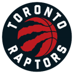
Toronto Raptors
 Sports Logo History
 Toronto Raptors Primary Logo 2021 - Present
In 1993, a cinematic masterpiece in the form of the movie "Jurassic Park" caused most to have an unexpected fascination with all things dinosaur-related. Not surprisingly, at this time the Toronto Raptors club was founded in Canada.
The logo featured a raptor wearing an "R" t-shirt and carrying a ball. The circle that surrounded the image was decorated with flanks. The picture has been modified several times, and five years ago it was drastically updated. Now it looks much more aggressive and at the same time more stylish: on a black background inside a red circle there is a silver-colored ball with huge dinosaur claw marks.
Boston Celtics
The team's name refers to the history of the city of Boston, where most residents are of Irish descent. In the 1940s, this notion was embodied through the shamrock of white on a background of green - known as the symbol of Ireland.
Later, the "Celts" had their own personal mascot, a leprechaun (Irish) with a cane and a pipe. This image, in various modifications, accompanies the emblem of the team to this day. The "Irish" emerald color remains unchanged.
Charlotte Hornets

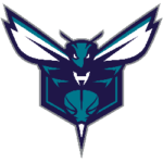
Charlotte Hornets Alternate Logo 2014 - Present
A team with a checkered past has been rebranded twice. In the late eighties, it started out as the Charlotte Hornets with a logo that represented a turquoise-colored hornet playing basketball.
After the "fall" and a safe revival, the logo name was redacted to "Charlotte Bobcats" because of the large number of bobcats in North Carolina. The mascot looked very sleek and catchy: a picture of a bobcat in motion in profile with the addition of an oblong slant in the team name. But in 2014, the Bobcats became the Hornets again. The aggressive spirit is represented in the form of a menacing stare, a stinger attached to the ball, and open wings.
Washington Wizards

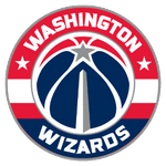
Washington Wizards Primary Logo 2015 - Present
Players began their careers in the '60s in Chicago as the Chicago Pacers. After the club moved to Baltimore (once the gun capital), the name was changed to Baltimore Bullets. The most memorable variant for the logos at the time was the combination of the two letters "LL", which formed a single picture representing hands reaching straight for the ball.
In the seventies, the club was in Washington under the name Capital Bullets, and later acquired the name Washington Bullets. But the changes did not end there either: due to unfavorable associations of most with the word "bullet" forced the owner of the club to think about rebranding. So the Washington Wizards appeared with a logo featuring a bearded wizard. The current version of the logo looks more patriotic: The logo includes a red-and-blue-colored ball, one of whose seams is associated with the Washington Monument.
Golden State Warriors
In 1946, a Philadelphia Phillies team came into existence. Two years later the name was changed to the Warriors. This name was visualized by an image of an Indian. This symbol persisted in various versions for 24 years.
After moving to San Francisco, the team received a new name, Golden State Warriors, and a logo depicting the world-famous Golden Gate Bridge. Since then, the team's branding elements have always included the bridge or the outline of the Bay. The only exception was a brief period at the turn of the century when the designers came up with suggestions for an image of a warrior holding a lightning bolt.
San Antonio Spurs
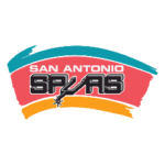
The Spurs "Fiesta" logo is an icon of NBA logos from the '90s.

San Antonio Spurs Primary Logo 1990 - 2002
Spurs fans have fond memories of those teams under David Robinson. You have to feel sorry for the Admiral because, in all of his highlights, he's dressed in monstrous, effeminate garb. A far cry from the days when he was at the Naval Academy.
This was the era of bright colors, intricate patterns, and mesh, for some reason a lot of mesh. It's a great example of how anything can be marketed as cool, but nostalgia shouldn't negate aesthetic truisms.
Houston Rockets
The Rockets have a long history of ridiculous logos, so it's hard to pick just one. But one is beyond the competition. It's classic pop art from the 1960s and '70s. In fact, the creator flew off to spend time with the people who sign bills on Capitol Hill so they could figure out how many leaves it takes to get into the Tootsie Pop Center.
In '71, the San Diego Rockets moved to Houston and changed their logo to another. The following year they changed the logo to another version, which they used until the mid-90s.
There are actually more than a few hundred basketball team logos from America. Each one is different and unique, and many have unusual and strange elements in these logos. But no matter how unusual the logos are, the most important thing is that they energize the game and motivate the players, which is why basketball teams often choose unusual logos that seem incomprehensible to us, but to them, in turn, are an attribute that allows them to perform better and win new awards. Logos are power and motivation.
Sports Logo History is a community of sports logo enthusiast who enjoys the history of each team’s logo history. Sports Logo History has primary logos, alternate logos, wordmark logos, or concept logos from the NFL, NBA, MLB, MLS, NHL, Premier League, WNBA, CFL, NCAA, ABA, USFL, AAF, and XFL.
Our partner site is Sports Team History takes a look at the history of each and every professional sports team. In addition, we have added Sports News History to our sports history websites. 24/7 non-stop sports news that's worth knowing. Finally, the premier sports team marketplace for your favorite team or college with thousands of items for you to peruse at Sports Market History.

