The Toronto Raptors are one of the newer franchises in the National Basketball Association, a team that only arrived in the mid-1990s. However, within under 30 years, the franchise has carved out an iconic style thanks to its stylish jerseys and legendary logo. The Toronto Raptors logo was inspired by Jurassic Park, which took movie theaters by storm around the …
The Humble Beginnings of the Velociraptor Logo
Founded in 1995 after a growing interest in the Canadian city to have an NBA franchise, the Toronto Raptors may be a relatively young team with a rich history. The 2019 NBA champion holds one of the league’s attendance records and is renowned for its distinctive logos and jerseys. In this article LeafletCasino experts who review online casino websites and …

Unusual Team Logos in the History of the NBA
As ridiculous as it may sound, players often choose teams based on their unusual logos; these logos attract attention and lend credence to the idea that the bet will be successful. Let’s take a look at the most distinctive logos of American basketball teams to gain a personal understanding of the unusual decisions made by today’s players. When looking at …
New Colors in the Raptors Latest Logo
The Toronto Raptors have had three different logos in their 25-year history and now they have a fourth. If you remember back in 2015, the Raptors removed their loving Raptor dinosaur from the logo that was used from their first season back in 1995. The new logo was a basketball with claw marks, a way to remember where the Raptor …
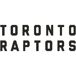
Toronto Raptors Logo History – Wordmark Logo
Our Toronto Raptors logo wordmark collection highlights the team’s distinctive wordmark designs. From early styles to modern updates, learn about Toronto Raptors logo history, explore NBA Toronto Raptors logo variations, and find new Toronto Raptors logo files, preserving unique wordmarks for every Raptors fan. Toronto Raptors 2021 – Present The Toronto Raptors made some color changes to their primary logo. …
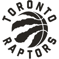
Toronto Raptors logo History – Alternate Logo
Our Toronto Raptors logo collection showcases alternate logos from the team’s bold Canadian legacy. From iconic emblems to modern designs, learn about Toronto Raptors logo history, explore NBA Toronto Raptors logo styles, and find new Toronto Raptors logo files, preserving unique logos for every Raptors fan. Toronto Raptors 2021 – Present The Toronto Raptors made some color changes to their …
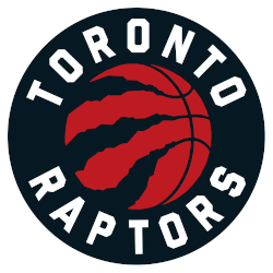
Toronto Raptors Logo History – Primary Logo
Get a front-row seat to the Toronto Raptors logo and its fierce legacy. From bold beginnings to today’s sharp claw, we dive into the Toronto Raptors logo history, offer NBA Toronto Raptors logo details, and showcase the new Toronto Raptors logo, celebrating the team’s roar for every Raptors fan. Toronto Raptors 2021 – Present The Toronto Raptors made some color …