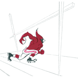
St. Louis Cardinals 1970 – 1987 In 1970 the logo came to be what is today the streamlined version of the a cardinal head with an attitude. The Cardinals logo was designed by Verlander Design.Cardinals Primary LogoCardinals Wordmark LogoCardinals Team HistoryCardinals Alternate Logo The St. Louis Cardinals have a long and proud history of alternate logos representing the team’s commitment …
MLB Team Logo Battle
MLB Primary LogoMLB Alternate LogoMLB Wordmark LogoMLB Team HistoryMLB Greatest Player (Unlimited votes) Choose your favorite current MLB team logo? Arizona Diamondbacks Primary Logo 2024 – Present Atlanta Braves Primary Logo 2022 – Present Baltimore Orioles Primary Logo 2019 – Present Boston Red Sox Primary Logo 2009 – Present Chicago Cubs Primary Logo 1979 – Present Chicago White Sox Primary …
St. Louis Cardinals (Football) Wordmark Logo
St. Louis Cardinals 1970 – 1987 In 1970 the logo came to be what is today the streamlined version of the a cardinal head with an attitude. The Cardinals logo was designed by Verlander Design.Cardinals Primary LogoCardinals Alternate LogoCardinals Team HistoryCardinals Wordmark Logo The St. Louis Cardinals football team has had a long and celebrated history, with their logo changing …
#1 Ultimate Guide to NFL’s Arizona Cardinals Logo History
The Arizona Cardinals are one of the oldest teams in the NFL, dating back to the league’s inaugural football season in 1920. A lot has changed in the game of football since then, and the Cardinals’ team is no different. Not only has the team made many changes and many locations changes over the years, so have their primary logo! …
St. Louis Cardinals Wordmark Logo
Cardinals Alternate LogoCardinals Primary LogoCardinals Team HistoryCardinals Team MerchCardinals Wordmark Logo The St. Louis Cardinals are one of the most iconic teams in Major League Baseball, and their wordmark logo has been a part of that identity since 1922, particularly in relation to the St. Louis Cardinals Primary logo. The original design featured an interlocking “SL” with a cardinal perched …
MLB Wordmark Logo
Wordmark Logos Arizona Diamondbacks Double lined wordmark “DIAMOND” on top and “BACKS” on bottom in black with a Sonoran sand outline. Descenders of letters “A” and “K” extended to simulate a diamondback’s fangs.See Team LogosAthletics A wordmark “ATHLETICS” in dark green sans serif font.See Team LogosAtlanta Braves Slanted wordmark “Braves” in scarlet with a navy outline.See Team LogosBaltimore Orioles A …
MLB Logo History
MLB Logos PRIMARY See each and every team’s primary logos from the MLB.See TeamsALTERNATE See each and every team’s alternate logos from the MLB.See TeamsWORDMARK See each and every team’s wordmark logos from the MLB.See TeamsBaseball Sports Fan Products Ultra Game Men’s NBA Official Super Soft Supreme T-Shirt 4.7 out of 5 stars(16971) Buy Now Campus Colors NCAA Adult Gameday …
St. Louis Cardinals Alternate Logo
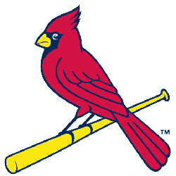
St. Louis Cardinals 1999 – Present In 1998, the “birds on the bat” was updated for the first time in 30 years with more detailed bird and bolder letters. The new single red with navy blue outline cardinal has a yellow beak with white eyes. The scripted wordmark “Cardinals” in red with a navy blue trim is a much bolder …
MLB Alternate Logo
Alternate Logos Arizona Diamondbacks A red diamondback snake head biting on a white baseball trimmed in tan.See Team LogosAthletics An elephant standing upon a baseball and holding a baseball bat in green with highlights in white, wearing a white banner featuring the letter “A’s” in gold on its back.See Team LogosAtlanta Braves Crossed red tomahawks with blue trim and yellow …
St. Louis Cardinals Primary Logo
St. Louis Cardinals 1999 – Present In 1998, the “birds on the bat” was updated for the first time in 30 years with more detailed bird and bolder letters. The new single red with navy blue outline cardinal has a yellow beak with white eyes. The scripted wordmark “Cardinals” in red with a navy blue trim is a much bolder …
- Page 1 of 2
- 1
- 2

