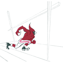
The Lamar Cardinals logo history highlights the steady evolution of the Lamar Cardinals wordmark logo and its influence on the Lamar University football logo. From classic typography to modern athletic branding, these marks reflect school pride and competitive identity while preserving tradition across decades of collegiate sports excellence. Lamar Cardinals 2010 – Present A red cardinal’s head above the wordmark …
Lamar Cardinals Logo History – Alternate Logo
The Lamar Cardinals logo has featured several alternate versions throughout the program’s history, reflecting the team’s evolving identity. Each Lamar Cardinals alternate logo complements the primary design while maintaining tradition. Fans also recognize the Lamar University football logo and Lamar Cardinals alternate logo PNG, which appear across uniforms, digital media, and merchandise. Lamar Cardinals 2010 – Present A red cardinal’s …
Lamar Cardinals Logo History – Primary Logo
The Lamar Cardinals logo history highlights the evolution of the team’s primary visual identity. From its earliest designs to the current Lamar Cardinals primary logo, this page details updates used across Lamar University football and other athletic programs. It also includes references to how the logo shapes the team’s overall branding and recognition. Lamar Cardinals 2010 – Present A red …
Incarnate Word Cardinals Logo History – Wordmark Logo
The Incarnate Word Cardinals logo history highlights the growth of the Incarnate Word Cardinals Wordmark logo across athletic programs, including Incarnate Word Cardinals baseball. Each Incarnate Word logo PNG reflects branding updates that balance tradition with modern style. This collection shows how the Incarnate Word Cardinals logo continues to strengthen university recognition. Incarnate Word Cardinals 2011 – Present A side …
Incarnate Word Cardinals Logo History – Alternate Logo
The Incarnate Word Cardinals logo has seen numerous alternate designs over the years, reflecting the growth of the program. Each alternate version emphasizes the team’s identity while complementing the primary logo. Fans often spot the Incarnate Word logo PNG on merchandise, uniforms, and digital media, alongside the popular Incarnate Word Cardinals baseball logo. Incarnate Word Cardinals 2011 – Present A …
Incarnate Word Cardinals Logo History – Primary Logo
The Incarnate Word Cardinals logo history explains how the university shaped its athletic identity through design. This page documents every Incarnate Word Cardinals primary logo, highlights Incarnate Word Cardinals baseball branding, and includes official Incarnate Word logo PNG files used from the beginning to today. Incarnate Word Cardinals 2011 – Present A side view of a cardinal’s head is in …
St. Louis Cardinals Logo History (Football) – Alternate Logo
The St. Louis Cardinals logo was part of the NFL’s visual evolution before the franchise relocated. Early alternates featured different red bird styles, football helmets, and typography variations. Some of these are now considered collectibles. Each version captured a unique point in St. Louis Cardinals logo history, leaving a strong visual legacy from the franchise’s time in Missouri.St. Louis Cardinals …
St. Louis Cardinals Logo History (Football) – Wordmark Logo
The St. louis cardinals logo wordmark is iconic in baseball. Its bold red script captures tradition and team pride. Though the design evolved, it still honors the vintage st louis cardinals logo look. The wordmark stands out in the rich st louis cardinals logo history of the franchise.St. Louis Cardinals 1970 – 1987 In 1970 the logo came to be …
Ball State Cardinals Logo History – Wordmark Logo
This page documents the complete Ball State Cardinals logo history with a focus on official wordmarks. Each Ball State Cardinals wordmark logo shows clear text-based branding used across different periods. Moreover, these Ball State Cardinals logo PNG wordmarks are displayed from the program’s early years through the present day. Ball State Cardinals 2015 – Present A Cardinal’s head in red, …
Ball State Cardinals Logo History – Alternate Logo
This page documents the complete Ball State Cardinals logo history with a focus on alternate designs used across different periods. Each Ball State Cardinals Alternate logo highlights branding flexibility beyond primary marks. These Ball State Cardinals logo PNG alternate logos are presented from the program’s early years through the current era. Ball State Cardinals 2015 – Present A Cardinal’s head …


