What makes a logo live on, not for years, but decades? What turns a design into a legacy? The logo of the Dallas Mavericks isn’t merely an emblem: it is a story that never stopped evolving. The untamed fury of the court, the pride of a city, and the roar of thousands in the crowd. Somehow, it still feels fresh! …
Nebraska-Omaha Mavericks Logo History – Wordmark Logo
The Nebraska-Omaha Mavericks logo history showcases how the program’s identity evolved through consistent wordmark branding. The UNO Mavericks wordmark logo reflects school pride and clarity, while the Omaha Mavericks logo remains a recognizable element across athletics, merchandise, and official media from early designs to present-day formats. Nebraska-Omaha Mavericks 2011 – Present An interlocked letter “O” with a red letter “O” …
Nebraska-Omaha Mavericks Logo History – Alternate Logo
The Nebraska-Omaha Mavericks logo history highlights the evolution of the team’s alternate branding over the years. This page showcases every Omaha Mavericks logo, along with official UNO Mavericks alternate logo designs and high-quality Omaha Mavericks logo images, illustrating the team’s growth and dynamic identity. Nebraska-Omaha Mavericks 2011 – Present An interlocked letter “O” with a red letter “O” and a …
Nebraska-Omaha Mavericks Logo History – Primary Logo
The Nebraska-Omaha Mavericks logo has evolved significantly over the years, reflecting the identity of UNO athletics. This page highlights the UNO Mavericks primary logo, including official Omaha Mavericks logo versions, showing how the design has remained bold, recognizable, and consistent across all uniforms, merchandise, and media platforms. Nebraska-Omaha Mavericks 2011 – Present An interlocked letter “O” with a red letter …

UT Arlington Mavericks Logo History – Wordmark Logo
The UT Arlington Mavericks logo history showcases the evolution of official wordmark logos used by the program. From classic designs to modern updates, each UT Arlington Mavericks wordmark logo pairs with the UT Arlington Mavericks football branding, reflecting consistent identity across all athletics and NCAA competitions throughout the team’s history. UT Arlington Mavericks 2010 – Present A side view of …
UT Arlington Mavericks Logo History – Alternate Logo
The UT Arlington Mavericks logo history showcases how alternate designs supported the program’s evolving identity. This page presents every UT Arlington Mavericks alternate logo, alongside key references to UT Arlington Mavericks football, highlighting how branding adapted across different eras. UT Arlington Mavericks 2010 – Present A side view of a horse’s head in orange, white and blue above an arched …
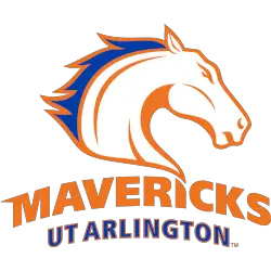
UT Arlington Mavericks Logo History – Primary Logo
The UT Arlington Mavericks logo history traces the evolution of the UT Arlington Mavericks primary logo across the program’s history. This page highlights how the UT Arlington Mavericks football branding and other visual elements have developed, ensuring a strong, consistent identity for Mavericks athletics at every level. UT Arlington Mavericks 2010 – Present A side view of a horse’s head …

Houston Mavericks Logo History – Primary Logo
The Houston Mavericks logo represents the team’s identity and competitive spirit in the ABA. From original designs to modern digital versions, the Houston Mavericks basketball logo showcases the team’s style, while the Houston Mavericks logo history highlights every primary emblem used by the franchise throughout its ABA journey.Houston Mavericks 1968 – 1969 A bull with steam coming out of both …
Dallas Mavericks Logo History – Wordmark Logo
Our Dallas Mavericks logo wordmark collection highlights the team’s standout wordmark designs. From early styles to recent updates, learn about Dallas Mavericks logo history, explore old Dallas Mavericks logo variations, and find new Dallas Mavericks logo designs, preserving unique wordmarks for every Mavericks fan. Dallas Mavericks 2018 – Present Incorporating a shield with a the head of a stallion, the …
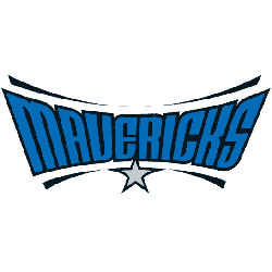
Dallas Mavericks Logo History – Alternate Logo
Our Dallas Mavericks logo collection showcases alternate logos from the team’s bold Texas legacy. From iconic designs to modern emblems, learn about Dallas Mavericks logo history, find the new Dallas Mavericks logo, and explore old Dallas Mavericks logo styles, preserving unique logos for every Mavs fan. Dallas Mavericks 2018 – Present Incorporating a shield with a the head of a …
- Page 1 of 2
- 1
- 2