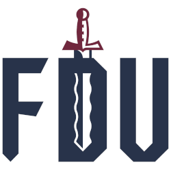
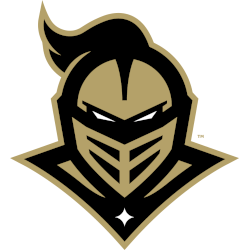
FairLeigh Dickinson Knights 2023 – Present A flame-bladed sword, a nod to the Hackensack River with the initials “FDU” in blue with white trim. The sword is split in half, each colored white and blue to represent the Township of Teaneck and the City of Hackensack. The handle of the sword features a castle-like design, an ode to Iviswold, the …
Fairleigh Dickinson Knights Alternate Logo
FairLeigh Dickinson Knights 2023 – Present A flame-bladed sword, a nod to the Hackensack River with the initials “FDU” in blue with white trim. The sword is split in half, each colored white and blue to represent the Township of Teaneck and the City of Hackensack. The handle of the sword features a castle-like design, an ode to Iviswold, the …
Fairleigh Dickinson Knights Primary Logo
FairLeigh Dickinson Knights 2023 – Present A flame-bladed sword, a nod to the Hackensack River with the initials “FDU” in blue with white trim. The sword is split in half, each colored white and blue to represent the Township of Teaneck and the City of Hackensack. The handle of the sword features a castle-like design, an ode to Iviswold, the …
Bellarmine Knights Logo History – Wordmark Logo
The Bellarmine Knights logo history showcases the evolution of the team’s visual identity from past to present. Each Bellarmine Knights Alternate logo highlights unique designs, while several logos were produced as Bellarmine Knights logo PNG files for digital and print use. This page presents all wordmark logos for the program, offering a complete look at the Bellarmine Knights’ branding journey. …
Bellarmine Knights Logo History – Alternate Logo
The Bellarmine Knights logo history highlights each change made to the team’s visual identity over the years. Fans can view every Bellarmine Knights Alternate Logo along with clear Bellarmine Knights logo PNG files that show how the program refined its look. This page provides all alternate logos from the start to today, presented with short, readable details. Bellarmine Knights 2020 …
Bellarmine Knights Logo History – Primary Logo
The Bellarmine Knights logo history highlights a series of primary logo changes that helped shape the program’s identity. Each new Bellarmine Knights primary logo introduced sharper lines and stronger symbolism. This page also includes high-quality Bellarmine Knights logo PNG files, allowing fans to follow the evolution of the team’s main branding from its earliest marks to the modern design. Bellarmine …
Central Florida Knights Wordmark Logo
Central Florida Knights 2017 – Present Initials “UCF” in gold with white highlights on a formed black background arranged in a diagonal pattern. Changed their color gold. Knights Primary LogoKnights Alternate LogoKnights School HistoryKnights School MerchKnights Wordmark Logo The Central Florida Knights wordmark logo has a long and rich history. The original logo, which was introduced in 1979, featured the …
Central Florida Knights Alternate Logo
Central Florida Knights 2017 – Present Initials “UCF” in gold with white highlights on a formed black background arranged in a diagonal pattern. Changed their color gold. Knights Primary LogoKnights Wordmark LogoKnights School HistoryKnights School MerchKnights Alternate Logo The Central Florida Knights have a long and storied history when it comes to their logos. The first logo for the Knights …
Central Florida Knights Logo History – Primary Logo
The Central Florida Knights logo history shows how the team’s identity has evolved over time. This page features every Central Florida Knights Primary Logo, along with the official Central Florida University logo. All logos are displayed from the earliest design to the current version. Central Florida Knights 2017 – Present Initials “UCF” in gold with white highlights on a formed …


