St. Joseph’s Hawks 2018 – Present A high-flying red and black hawk. Former alternate logo. Hawks Alternate LogoHawks Wordmark LogoHawks School HistoryHawks Primary Logo The St. Joseph’s Hawks have a long and proud history that dates back to the early 1900s. The school has seen many changes over the years, but one thing that has remained constant is its primary …
Atlanta Hawks Alternate Logo
Atlanta Hawks 2021 – Present A minor update to the Atlanta Hawks primary logo for the 2020 – 2021 NBA season, the Hawks updated the font used in the wordmark in the roundel and also removed the word “CLUB” from the logo entirely. The team’s modernized “Pac-Man” logo remains, surrounded now with “ATLANTA HAWKS BASKETBALL” in white. Hawks Primary LogoHawks …
Atlanta Hawks Wordmark Logo
Atlanta Hawks 2021 – Present A minor update to the Atlanta Hawks primary logo for the 2020 – 2021 NBA season, the Hawks updated the font used in the wordmark in the roundel and also removed the word “CLUB” from the logo entirely. The team’s modernized “Pac-Man” logo remains, surrounded now with “ATLANTA HAWKS BASKETBALL” in white. Hawks Alternate LogoHawks …
Milwaukee Hawks Primary Logo
Milwaukee Hawks 1954 – 1955 For what would ultimately prove to be their last season in Milwaukee, the Hawks updated their color scheme to blue. A change to their logo accompanied the shift with the hawk now in a light blue and black, still clutching a basketball over an unguarded hoop with the wordmark “MILWAUKEE HAWKS” arched upwards below.Hawks Wordmark …
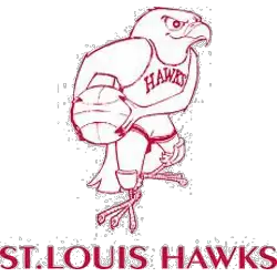
St. Louis Hawks Primary Logo
St. Louis Hawks 1958 – 1968 In 1957 the Hawks introduced this Disney-looking cartoon red hawk holding a basketball wearing a Hawks uniform and a wordmark “ST. LOUIS HAWKS” below the hawk. The hawk also has kneepads on each knee.Hawks Team HistoryHawks Primary Logo The St. Louis Hawk’s primary logo has a long and interesting history. The team was founded …
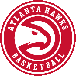
Atlanta Hawks Primary Logo
Atlanta Hawks 2021 – Present A minor update to the Atlanta Hawks primary logo for the 2020 – 2021 NBA season, the Hawks updated the font used in the wordmark in the roundel and also removed the word “CLUB” from the logo entirely. The team’s modernized “Pac-Man” logo remains, surrounded now with “ATLANTA HAWKS BASKETBALL” in white. Hawks Alternate LogoHawks …
- Page 2 of 2
- 1
- 2

