A trendy graphic designer and illustrator named Peter Good has passed away. He was 80 years old. His career lasted more than five decades. Peter Good and his wife collaborated to create memorable logos for various corporations, nonprofit organizations, and other institutions. A couple of notable logos included the logo for the Mark Twain House & Museum and the …

6 Iconic Logos the Fans Still Love Today
No season goes on without a single team changing its primary logo, sometimes with a complete overhaul of its brand. But not all changes are received with enthusiasm by fans. Yes, some changes are met with open arms and get their well-deserved praise. Others, however, quickly become a source of frustration and sometimes even anger. So, today, let’s pay tribute …

When Only The Hometown Name Make Sense
Hartford Whalers Primary Logo 1993 – 1997 Professional sports franchises relocate all of the time. It’s a fact of life, no matter the game. The Carolina Hurricanes used to be the Hartford Whalers. The Texas Rangers were the Washington Senators. The Tennessee Titans began as the Houston Oilers. In the NBA, the franchise’s movement is perhaps the most rampant of …
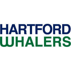
Hartford Whalers Logo History – Wordmark Logo
The Hartford Whalers logo shines in the team’s wordmark logo collection, evolving since 1979 in the NHL. Its sleek text reflects Connecticut’s maritime spirit. Therefore, the Hartford Whalers history captivates collectors. Moreover, the Hartford Whalers NHL emblem showcases vibrant identity and regional pride.Hartford Whalers 1993 – 1997 In 1993 the Whalers made some modern changes to their final logo. A …

Hartford Whalers Logo History – Alternate Logo
The Hartford Whalers logo shines in the team’s alternate logo collection, evolving since 1979 in the NHL. Its bold whale tail reflects Connecticut’s maritime spirit. Therefore, the Hartford Whalers history captivates collectors. Moreover, the Hartford Whalers NHL team’s emblem showcases vibrant identity and regional pride.Hartford Whalers 1993 – 1997 In 1993 the Whalers made some modern changes to their final …

Hartford Whalers Logo History – Primary Logo
The Hartford Whalers primary logo collection showcases the team’s nostalgic NHL history. With bold whale tail designs, the Hartford Whalers logo ignites team spirit. This collection explores Hartford Whalers history, connecting fans to the vibrant legacy of the Hartford Whalers and Hartford Whalers NHL designs.Hartford Whalers 1993 – 1997 In 1993, the Whalers made some modern changes to their final …