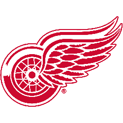
The Detroit Red Wings have been one of the most successful teams in National Hockey League history. In fact, they are the winningest American team in a sport that has long been dominated by Canadian teams, the country where the sport originated. Detroit has won 11 Stanley Cup championships, trailing only Montreal Canadiens and Toronto Maple Leafs for most all-time.
Detroit was awarded an NHL franchise in 1926. The team purchased the roster of the defunct Victoria Cougars in the Western Hockey League, so they called their new team the Detroit Cougars. The team was not good in those early years, and the local newspaper held a contest to rename them. The winning name was the Detroit Falcons, but that name didn’t stick very long either. In 1932, millionaire James Norris purchased the team and felt that another name and logo change would bring them some luck. Norris had played amateur hockey in Montreal in his youth and was a member of the 1893 Montreal Hockey Club that won the first-ever Stanley Cup. The team was named the Winged Wheelers and had a logo of a wheel and tire with wings. Norris used this logo as inspiration for his new team in Detroit because even in 1926 Detroit was already called the Motor City because of its automobile production. The logo he came up with was a simple round tire with short, flame-like wings in red and white.

Detroit Red Wing Primary Logo 1949 - Present
The new logo that James Norris created for his team (now named the Detroit Red Wings) did bring them some luck. The Detroit Red Wings made the NHL playoffs in the first year after switching to the new name and new logo. In fact, the logo has remained one of the longest-running logos of any sports team with only minimal redesigns. In fact, each time the logo has been updated, the Detroit Red Wings seem to play rather well. The first redesign of the logo was in 1936, and the Red Wings went on that year to win their first Stanley Cup. Then, the logo was updated for the final time during the 1948-49 season. The Red Wings made it to the Stanley Cup that season and went on to win the Cup the next year. The Red Wings logo has remained completely unchanged since 1949.
The Red Wings logo is wonderfully simplistic, a trait that has allowed it to endure for more than 70 years. The simple circular wheel and tire are the type you would find on a Ford Model T in 1926 and despite tire technology advances, the tire in the logo remains the same. The wings extend to the right of the tire, slightly different from the Montreal logo which showed the wings more vertical. Over the years, the logo has only been modified slightly to change the shading and extend the wings a bit. When you strike gold on your first try, there’s no need to change what works.
See the Detroit Red Wings logo history and team history.
___
Sports Logo History is a vibrant community of sports logo enthusiasts who share a deep appreciation for the captivating histories behind each team's logo. We take pleasure in exploring the evolution of primary logos, alternate logos, and wordmark logos from renowned leagues such as the NFL, NBA, MLB, MLS, NHL, Premier League, WNBA, CFL, NCAA, UFL, ABA, USFL, AAF, and XFL. Immerse yourself in the intricate details and stories behind these iconic symbols that represent the essence of each team.
In the enthralling realm of sports, the battle of logos among different leagues unfolds as a captivating and ongoing spectacle. Step into the world of Sports Logo History, where we showcase the relentless pursuit of distinction by leagues such as the NFL, NBA, MLB, Premier League, and countless others. Witness the captivating journey as each league strives to create logos that not only capture the essence of their sport but also resonate deeply with fans.
Immerse yourself in the comprehensive sports history provided by Sports Team History, our esteemed partner site, where you can discover the triumphs, challenges, and defining moments that have shaped the legacies of professional sports teams. Stay up to date with the latest sports news through Sports News History, a platform delivering 24/7 coverage of highlights, player interviews, and game analyses. Additionally, express your unwavering support for your favorite teams by exploring Sports Store History, the premier sports team marketplace offering a vast selection of jerseys, memorabilia, and collectibles. Join our community today and celebrate the rich history, iconic logos, and passion of sports.

