
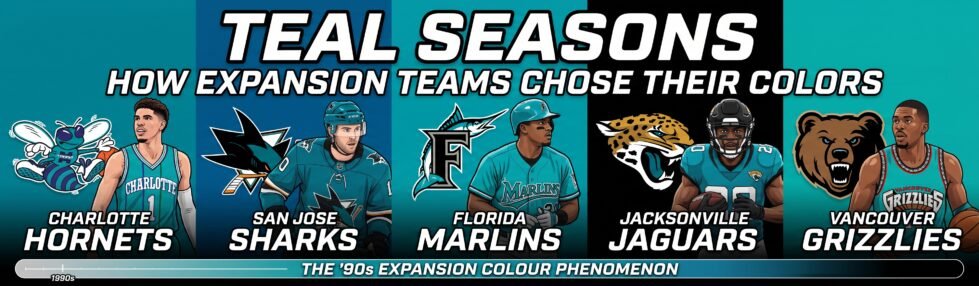
An expansion team starts life with no championships, no old photographs, and no grandfather who remembers the first game. On day one, it can own only one thing: a color. Between 1988 and 1995, a run of new franchises in four leagues made that choice in public, and a surprising number of them landed on the same answer. Teal went from a fashion shade to the defining look of a sports decade in about five years, highlighting the significance of expansion team colors.
The story is worth retracing because the teams arrived at teal for different reasons, abandoned it for different reasons, and then, one by one, went back to it.
Understanding the evolution of expansion team colors can provide insight into branding strategies and fan engagement.
The choices made by these teams reflect their identity and how they wish to be perceived in the competitive landscape of sports, often revolving around their expansion team colors.
A Fashion Designer Handed Charlotte Its Palette

The trend started with a clothing designer, not a sports agency. In 1988, Charlotte Hornets owner George Shinn asked Alexander Julian, a Chapel Hill native and menswear designer, to create uniforms for the new NBA club. Purple and teal had always been Julian’s signature combination, and he brought it straight to basketball. By his own account, he also pointed out that the team’s arena used forest green rather than teal, and he fixed that too. His fee, he says, was a monthly five-pound batch of pulled pork from a local barbecue restaurant.
The result looked nothing like the league around it. Pinstripes on a basketball uniform read as tailoring, and the original logo, a grinning hornet named Hugo in white gloves and sneakers bouncing a basketball, gave the club a character rather than a crest. Julian’s work landed so well that Dean Smith called him in 1990 to redesign the North Carolina Tar Heels’ uniforms.
San Jose Asked a Department Store What Would Sell
When the NHL awarded San Jose a franchise to begin play in 1991, the new club treated color as market research. Dan Rusanowsky, the Sharks’ longtime radio voice, later recalled that team officials went to Bloomingdale’s and other retailers to ask which colors were popular. They wanted a uniform the players would be proud to wear and one that would appeal to men and women alike. The consultants pointed to teal. The Sharks wanted something a little more rugged, so they added black.
Terry Smith of Terry Smith Creations drew the mark that went with it: a shark bursting through a triangle with a hockey stick clamped in its jaws. The triangle stands for San Jose, San Francisco, and Oakland, a signal that the team meant to represent the whole Bay Area. You can follow how that crest has changed through the San Jose Sharks primary logo history, from the 1991 original to the more three-dimensional shark of 2007-08.
The choice paid off before the club had its own building. The Sharks spent their first two seasons at the Cow Palace in Daly City, yet Rusanowsky described their gear as the number one merchandise item in sports for a year or two after the debut.
By 1993, Teal Was a Precedent
The Florida Marlins show how quickly an experiment turned into a formula. Original owner H. Wayne Huizenga reportedly preferred the name Florida Flamingos until the design director at Major League Baseball Properties talked him out of it. When the club chose its primary color, MLB’s own account notes, teal had already become popular with the Hornets and the Sharks.
The Marlins still insisted theirs was different. Team officials called it Marlins blue, describing a shade between aqua and teal that echoed local beaches and skies and was softer than the aqua the Miami Dolphins wore. The home whites carried teal pinstripes, the caps came in all-teal and teal-and-black versions, and a leaping marlin wrapped around the “F.” MLB’s own account adds a detail many fans forget: the Marlins wore teal jerseys only in 1993 and 1994, and only as batting practice tops.
Jacksonville Gave Teal Its Teeth

The Jacksonville Jaguars joined the NFL in 1995 and turned the soft 1990s palette into something aggressive. Their first logo never made it to the field. Ford Motor Company, then Jaguar’s parent company, felt the proposed mark looked too much like its own. The two sides settled without a trial: Jaguar became the team’s official car, and the team redrew its logo.
The replacement was a snarling gold jaguar head with black spots and a teal tongue. Then-owner Wayne Weaver credited the tongue to his wife and joked that it came from “feeding Panthers to our Jaguars,” a jab at the Carolina expansion team that entered the league the same year. The club wore teal jerseys for the first time on September 24, 1995, against the Green Bay Packers. The Jacksonville Jaguars primary logo page shows that head in use from 1995 through 2012, with only a tweak to the gold in 2002.
Vancouver Tied the Color to a Place

The last big teal launch of the era arrived with the NBA’s Canadian expansion in 1995, when the Vancouver Grizzlies joined alongside the Toronto Raptors. Vancouver paired turquoise with bronze, red, and black and set a snarling bear with a basketball beneath lettering inspired by the Indigenous art of the Pacific coast. Where Charlotte’s teal came from a designer’s taste and San Jose’s from a retail survey, Vancouver tied its palette to the forests and water of British Columbia.
The look drew a crowd at first. The Grizzlies averaged 17,183 fans a game in their inaugural season. But the team finished that year 15-67, attendance slid, and the club moved to Memphis in 2001, citing falling attendance and mounting losses. A cleaner, more subdued identity followed, and “Vancouver” disappeared from the jersey.
The Retreat Happened One Team at a Time
No league ever banned teal. It faded because each club found its own reason to move on. The Marlins began phasing it out by the late 1990s, switched their home pinstripes to black in 2003, and left it behind in 2012, when they became the Miami Marlins and adopted a Joan Miró-inspired palette of primary colors. A 2019 rebrand then brought in Caliente Red, Miami Blue, Midnight Black, and Slate Grey. In Charlotte, the NBA approved the Hornets’ move to New Orleans in May 2002 by a 28-1 vote, and the franchise took its name and colors with it. Jacksonville switched its primary home jersey from teal to black in Week 4 of the 2012 season, in Shad Khan’s first year as owner, and introduced a new logo the following year.
The Sharks were the exception. Rusanowsky put it simply: hockey is a traditional sport, and the club only darkened its teal slightly about five or six years in. The team that picked its color from a retail survey became the one most loyal to it.
Fans Voted the Color Back
The return to teal came from the stands. In February 2021, the Jaguars posted that they would make teal their primary home color again if a tweet reached 21,000 retweets. It passed 22,700, and the club confirmed the switch, with its equipment manager calling Jacksonville “the only team in the NFL that wears teal.” In 2024, the team added its Prowler throwbacks, based on the 1998-2008 uniforms and paired with the original 1995 helmet logo. The Jaguars wore them against New England in Week 3 of the 2026 season and plan to wear them again against Pittsburgh on Monday Night Football in Week 14.
Charlotte’s route took longer. Its NBA team, which had spent a decade as the Bobcats, reclaimed the Hornets name for the 2014-15 season, returned to purple and teal, and brought back Hugo as its mascot. The team reported multiple franchise sales records after the new Hornets gear went on sale in January 2014.
Anniversaries Put the Old Palettes Back on the Field
Anniversaries gave other clubs a reason to wear their 1990s colors again. Memphis marked its 30th anniversary in 2024-25 by wearing the white Vancouver-era Classic Edition uniform in turquoise, bronze, red and black, on a court that recreated the old Vancouver floor. The Marlins went further in 2026 without waiting for an anniversary, rolling out teal Sunday home uniforms after chief brand officer Alex Parker found that fan surveys kept linking teal to people’s first memories of the team. The jersey at the center of that set was one the franchise had once used only for batting practice.
That survey result holds the real lesson: a palette gains its pull through years of association, not through the choice itself. Any entertainment brand tempted to borrow a bold sports-style color scheme, whether a video game studio or one of the sweepstakes sites in PlayUSA’s list of sweepstakes casinos usa no deposit bonus offers, would face the same limit the Marlins found, because teal only started to mean something once people had memories to attach to it.
A Trend Report That Turned Into Tradition
The logos from this era have all been redrawn. The Sharks sharpened their shark in 2007, the Hornets designed a new, more aggressive insect for 2014, and the Jaguars replaced their head in 2013. The colors outlasted every one of those redesigns. Teal entered sports in 1988 because a menswear designer liked it, and in 1991 because a department store said it would sell. Thirty-five years later, fans defend it as tradition. The expansion clubs of that era did not know they were choosing a heritage color. They thought they were following a trend, and they had it half right.