Watford FC
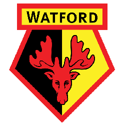
The latest Watford emblem changed the font on the wordmark again and used the previous emblem’s red deer’s head on a black and yellow section with red outline.
Watford FC Primary Logo
The Watford Football Club, commonly known simply as Watford, is a professional football club based in Hertfordshire, England. The club has been around since 1881 and has had an interesting history with its primary logo. Over the years the logo of this prestigious team has gone through several changes to reflect its changing identity and values.
The first iteration of the Watford FC primary logo was created in 1921 when they were admitted into Division Three South of English football’s league structure. It featured a yellow shield-like shape with three black stripes running across it horizontally from left to right and two red diagonal lines crossing them at each end respectively; all set against a white background which highlighted their colors perfectly for supporters who would soon be cheering on their beloved team from afar or up close at Vicarage Road Stadium where home matches are held today. This classic design served as an iconic representation for over 50 years until 1972 when it was replaced by another more modern version that still included elements like yellow coloring but also incorporated two lions on either side holding onto crossed swords – symbolizing strength and power – plus “WFC” written beneath them all inside blue circular outlines surrounding everything else neatly together making sure everyone knew exactly what they were looking at straight away even if they weren't familiar with other teams' logos yet!
In 2012 however, things changed again when after much deliberation between fans & staff alike; another new design emerged featuring just one lion (instead of two) standing proudly atop both crossed swords while being surrounded by four stars representing each divisional title won throughout their storied past - something many supporters could take pride in regardless whether or not you supported them personally because these successes have helped put Watford FC on the map globally! Finally underneath this majestic creature lies simple lettering spelling out 'Watford' name clearly so there's no mistaking whose badge this truly belongs to theirs alone forevermore now thanks partly due to those thoughtful decisions made back then that continue paying dividends till present day making sure everyone knows who stands behind such proud tradition every single time they see it displayed anywhere near far away...and beyond!
Watford FC
1982 - 2001
In 1982 Watford changed the font size on the wordmark "Watford" and redesigned the deer head. Continued with the two sections in black and yellow with a red outline.
Watford FC
1979 - 1982
In 1979 Watford changed the font on the wordmark "Watford" and kept the deer's head on a black and yellow sections.
Watford FC
1978 - 1979
In 1978, a new era started in the history of the logo. The emblem featured the head of a red deer inside a stylized shield divided into two fields, red and black. The word “Watford” was placed above and initials "FC" on both sides of red deer.

Watford FC
1974 - 1977
A cartoon version known as ‘Harry the Hornet’ appeared in 1974 but proved unpopular with the hornets faithful and was soon lost to the archives.
Watford FC
1972 - 1974
On the 1974 logo, an anthropomorphized hornet could be seen. The badge featured a hornet above the letters “WFC.”
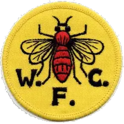
Watford FC
1968 - 1972
In the later part of the 1960s the club brought in a brand new circular design, with the focus pushed to a roaring hornet. The initials "W.F.C." in black arched around the hornet.
Watford FC
1959 - 1968
Back to the original shield from 1927, with initials "WFC" in yellow on a black shield on a yellow background.
Watford FC
1958 - 1959
In 1957 saw the arrival of a blue shield, in it a hart and the initials "W.F.C" in white above the banner with wordmark "WATFORD" in white on a blue background.
Watford FC
1950 - 1958
A shield with a side view of a deer's head above the initials "W.F.C" in black with a football below.
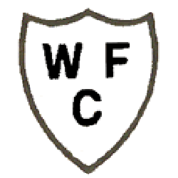
Watford FC
1927 - 1950
A white shield with black trim and initials "WFC."
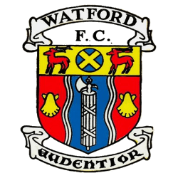
Watford FC
1898 - 1927
The first emblem Watford have been unofficially associated with is in fact the coat of arms of Watford Borough Council. The wavy blue and white lines are intended to represent the River Colne and its banks. The gold escallops were taken from the arms of the Earl of Clarendon, Watford’s first Mayor. The fasces or bundle of rods with an axe in the centre denote magisterial authority and the Roman station said to have been at Watford. The gold cross on blue is from the arms of St. Albans, the greater part of Watford having at one time belonged to the Abbey of St. Albans. The harts represents Hertfordshire. The motto is Audentior and means “Bolder”.
Soccer Sports Fan Products
