
It is indeed official. The Cleveland Indians will have a new name for their team starting with the 2022 season. For the first time since 1915, Cleveland will change the name of its baseball team. On Friday, the franchise announced via social media that the Cleveland Indians will now be known as the Cleveland Guardians.
The announcement was endorsed by team chairman and owner Paul Dolan. Dolan believes that the Guardians name is a better representation of the characteristics that define the city of Cleveland. He felt that the name reflects the pride that Cleveland natives feel towards the city.
This is the 5th name in franchise history. In 1901, the team was known as the Cleveland Blues. Next season, the Indians changed their name to the Cleveland Bronchos. After one season, Cleveland would change the team to the Naps until 1914. After that, the team would become known as the Indians and would remain so until today.
It is no secret that the Cleveland Indians' name has drawn criticism from Native Americans. Given the momentum in terms of social justice that caused the Washington Football Team to abandon its former name, it was time for a name change for the franchise. In December 2020, the franchise officially announced that they would be searching for a new name.
The franchise conducted a thorough process to find its new name. Officials spent over 140 hours talking to local community leaders and fans trying to get feedback on the name. The franchise surveyed 40,000 Guardian fans.
It goes without saying that there has to be a change to the team’s logo if there is a change to the team name.
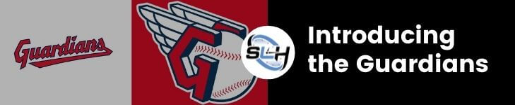
We have gotten used to seeing the watermark scripted logo in red with the word “Indians” for years. Now, the new watermark scripted logo says “Guardians” in red. It’s a perfect example of the cliché “Out with the old and in with the new.”

Another logo could be seen in the new upgraded letter “C.” The letter "C" is in a stylistic font and can be seen in a purple background. The letter "C" has a red logo and has a white outline.
The most interesting logo for the newly named Cleveland Guardians logo is contained within a red background, the logo contains a red G. A pair of wings is connected to the “G” logo. A baseball can be seen connected within the wings. It is almost as if the wings are guiding the ball to where it’s supposed to go.