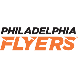
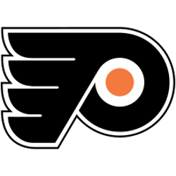
Flyers Wordmark Logo The Philadelphia Flyers have one of the most recognizable logos in professional sports. Their iconic orange and black “P” logo has been a staple of their franchise since 1967 when the team was founded. The original wordmark for the Flyers featured an italicized font with white text on a black background that read “Philadelphia Flyer’s Hockey Club.” …
Philadelphia Flyers Alternate Logo
Flyers Alternate Logo The Philadelphia Flyers have had a long and storied history, including the use of alternate logos. The original logo was created in 1967 by artist Sam Ciccone and featured an orange circle with white wings on either side. This logo was used until 1974 when it was replaced by a new design featuring two crossed hockey sticks, …
Philadelphia Flyers Primary Logo
Flyers Primary Logo The Philadelphia Flyers have been a staple of the NHL since 1967, and their iconic logo has become synonymous with the team’s success. Jerry Wolman designed the original logo in 1966 when he purchased the franchise from Ed Snider. It featured a stylized “P” over an orange and black shield – colors chosen to represent both Philadelphia’s …